Insight
We Did Everything We Wanted
<2023 New Year’s Greeting Goods> was carried out with a high level of autonomy for the designers who participated in the project. Perhaps because of that, we approached it more boldly than usual. In particular, the project was especially meaningful because participants who were not font designers were able to create fonts for the first time in their lives. Things that might have felt hard to attempt alone seemed to become possible when done together. From planning at the start of the year to the launch at the end of the year, we’d like to share the story of creating the New Year’s Greeting Goods—a journey of constant momentum.
March, Looking Back at 2022
The BX Team has been involved since the production of the <2022 New Year’s Greeting Goods>. We joined partway through after being asked to support packaging and other printed materials. Because we came in after much of the work was already underway, it was disappointing that we could only contribute in a limited way. We also felt that the addition of unplanned items reduced overall consistency, which stood out as an area for improvement.
To address these points, the <2023 New Year’s Greeting Goods> project was approached more systematically, with the BX Team participating from the planning stage onward.
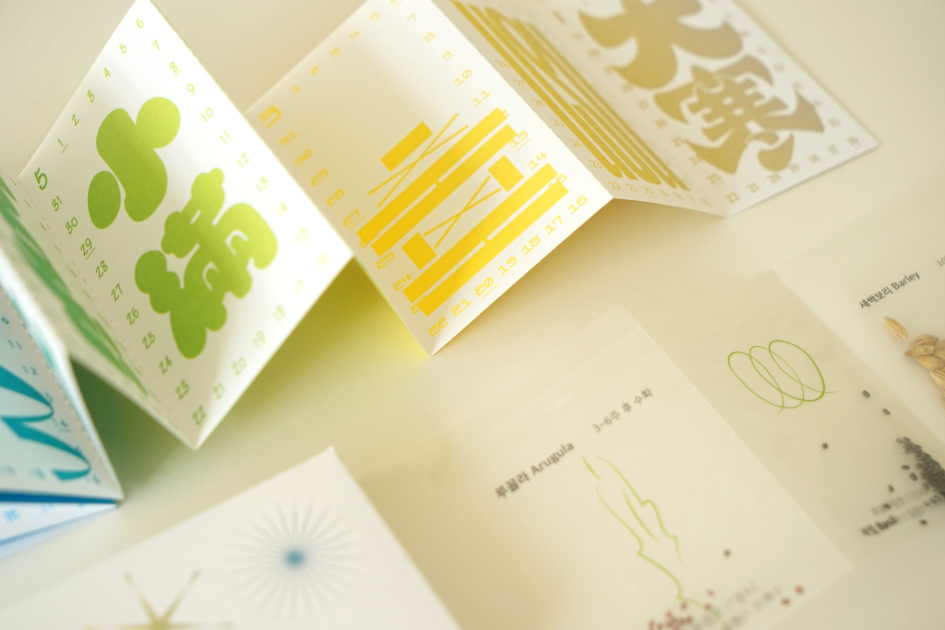
<2022 New Year’s Greeting Goods> Seasonal Calendar
April, What Should We Make?
<2022 New Year’s Greeting Goods> used the medium of a calendar to showcase lettering work. For 2023, the project moved forward as an extension of that idea, with the direction set to create the numerals used in the calendar as a variable font. Ideation for the goods also began in line with this direction.
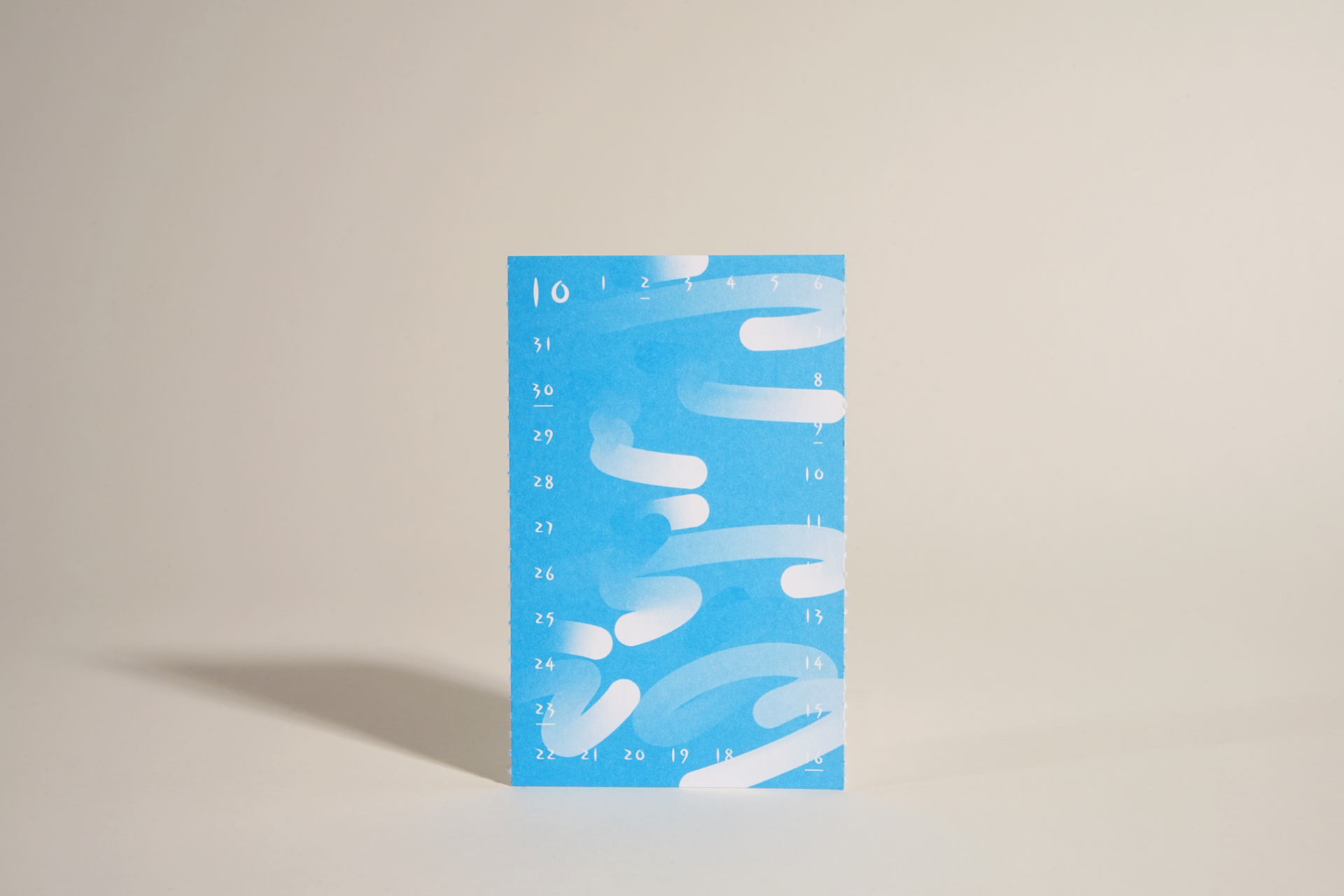
<2022 New Year’s Greeting Goods> Seasonal Calendar Hanro(寒露)
*Hanro (寒露) is the 17th of the 24 solar terms. Literally meaning “cold dew,”
it refers to the period when the air grows colder and dew forms just before it turns into frost.
We saw the numerals in a calendar as carrying a strong sense of “commemoration.” With that in mind, for 2023 we wanted to convey the message that “every day is a celebration,” wishing that both ordinary days and special days alike could be happy ones. We also wanted to express, through a 365-day calendar, that Sandoll is present alongside those happy days.
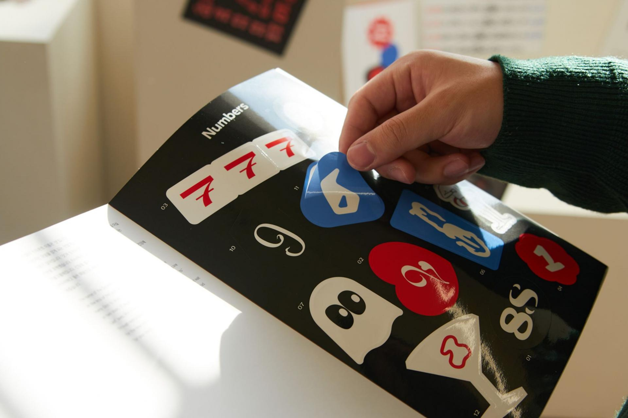
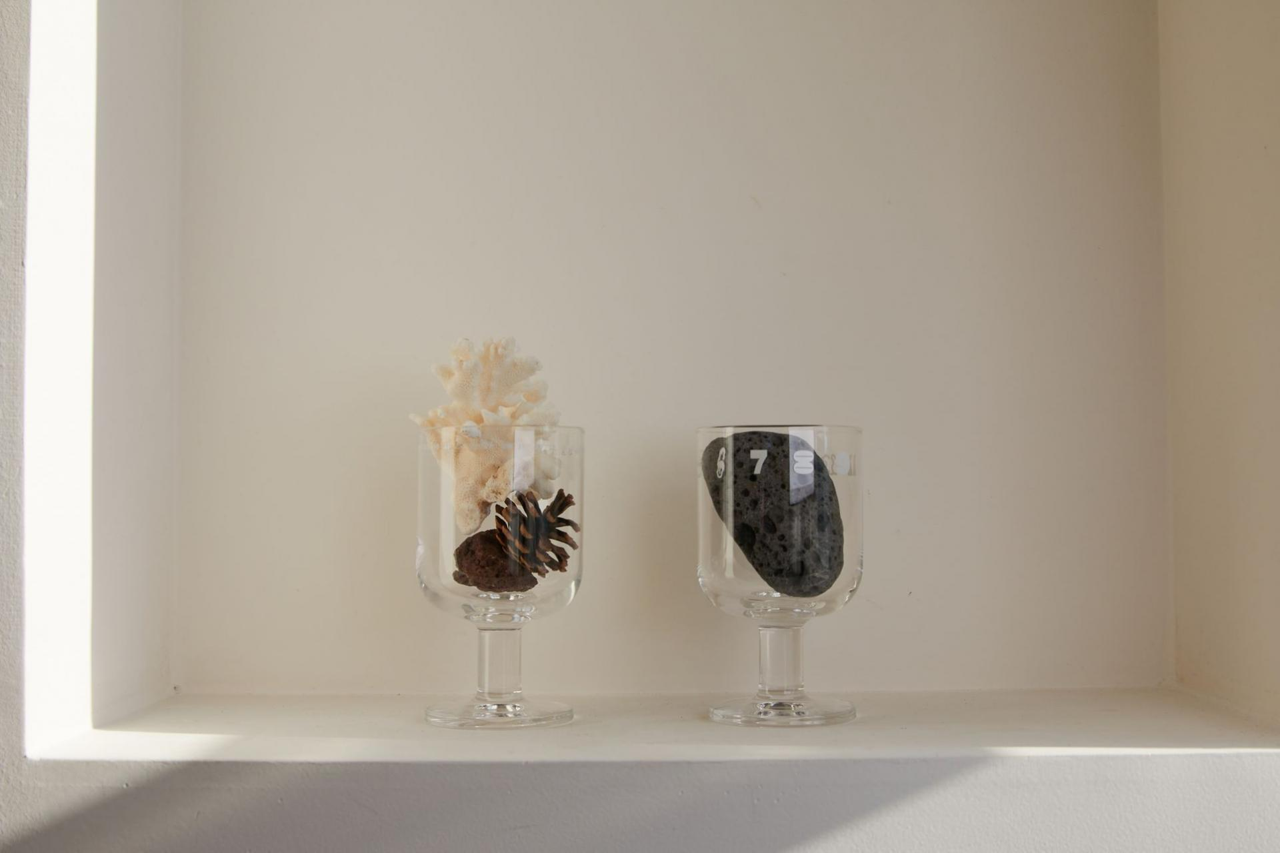
Following this line of thought, we decided to create a goblet as the goods—something that can be used on special occasions while also allowing users to mark and celebrate their own personal anniversaries.
June, Design Begins!
We shared the overall direction with the designers participating in the <2023 New Year’s Greeting Goods> project and assigned each person a month. To avoid overlapping font concepts, we gathered regularly for feedback sessions, sharing drafts and exchanging ideas along the way. Centered on the overarching theme of “anniversaries,” the goods were interpreted from various perspectives—special days, seasons, and cycles—resulting in a wide range of outcomes.
For those curious about the font and calendar designs for each month, detailed explanations can be found in the previous article (Link).
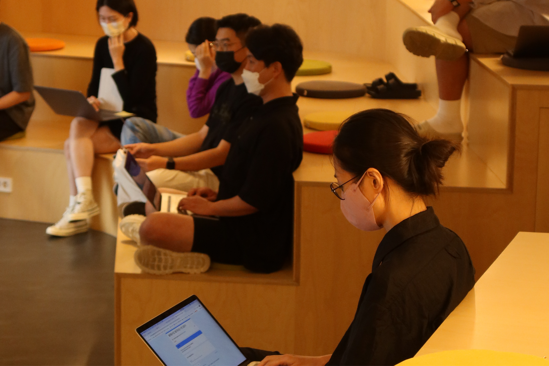
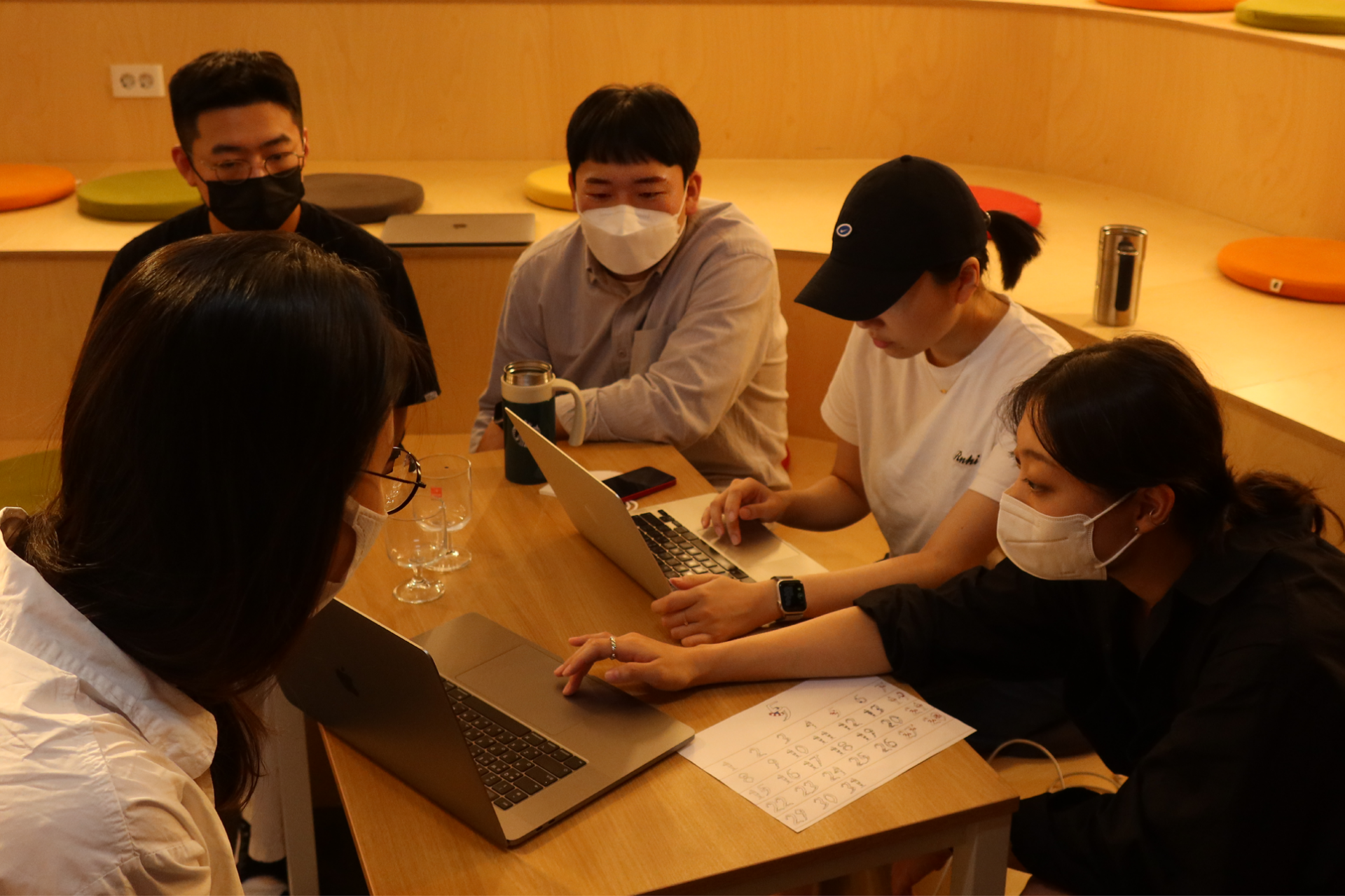 Production Team and Planning Team
September, the First Question
The New Year’s Greeting Goods, launched at the end of the year, are distributed not only by Sandoll but also through Sandoll Cloud. While both brands share the same purpose of expressing gratitude, there is a difference: Sandoll, as a font foundry, carries a research-oriented character, while Sandoll Cloud needs to reflect its nature as a platform. Ideally, creating separate goods for each brand would clarify each message, but within limited conditions, we had to find another approach.
To minimize confusion, we eliminated all colors except the two brand colors. By carefully balancing Sandoll’s red and Sandoll Cloud’s blue, we aimed to find a design in which both could coexist. We also hoped that, as users looked through the goods, they would naturally be reminded of both Sandoll and Sandoll Cloud.
In terms of composition, we kept the goods items the same, but differentiated the thank-you cards that conveyed the messages more directly.
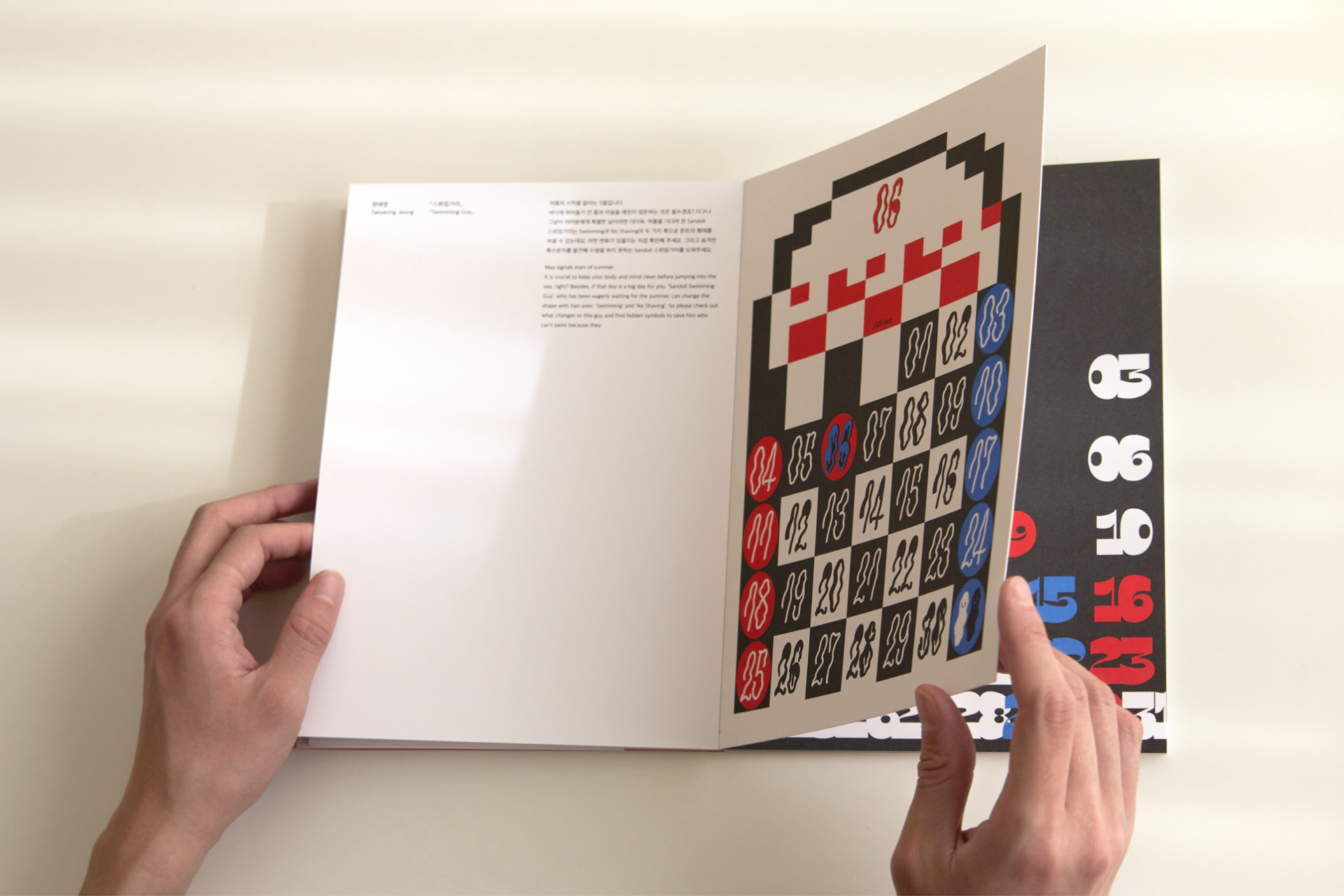
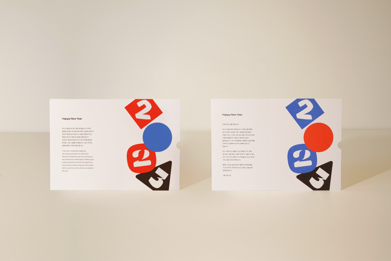 <2023 New Year’s Greeting Goods> calendar and New Year’s greeting card
October, the Second Question
We needed a way to bring everything together while allowing the unique appeal of each font to come through. At the same time, we wanted to show that engaging compositions could be created using numeral fonts alone.
There were many ideas. We explored approaches that emphasized the presence of individual fonts, layouts where multiple fonts blended together, and compositions that featured the goods more directly. After discussions with the production team, we aligned on a direction in which multiple fonts could coexist while still expressing the distinct character of each form. We also felt this approach could effectively capture the lively, bustling atmosphere of the year-end and New Year season.
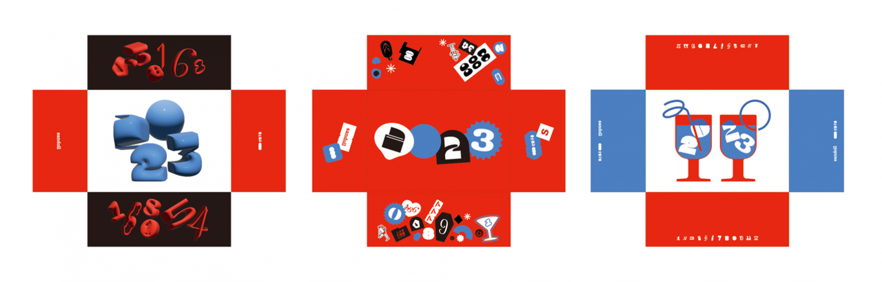
<2023 New Year’s Greeting Goods> package concepts
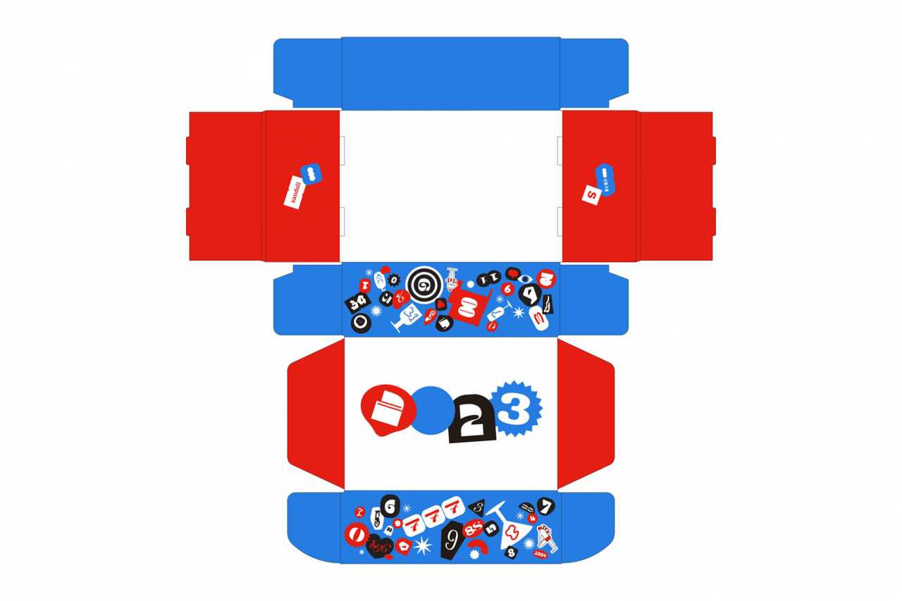 <2023 New Year’s Greeting Goods> final package
November, a Nerve-Racking Print Check
At last, it was time for the press check. It was a print shop I had visited many times, yet my nerves never seem to fade. I arrived with a pounding heart.
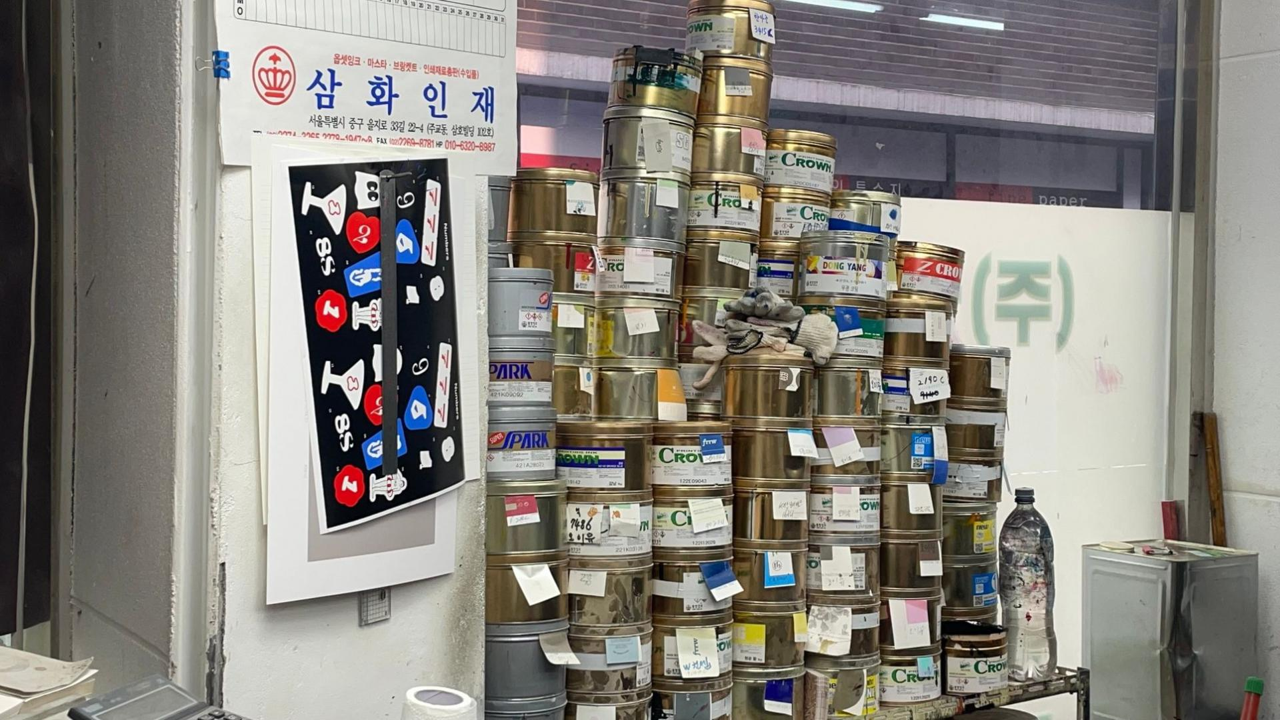
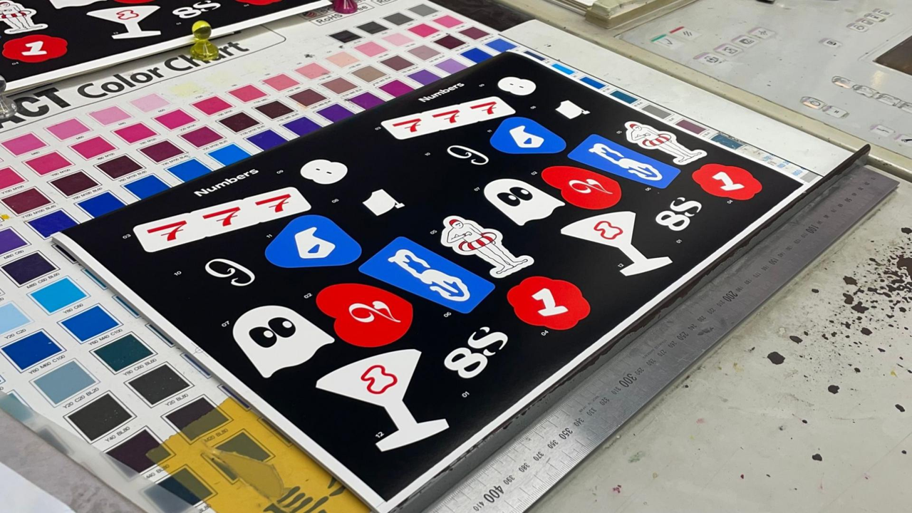
At the shop, the press operator refers to the Pantone color chips we provided in advance and mixes the inks for printing. “Please increase the density,” “Please add more yellow.” After several adjustments like these, the final colors are fixed and production begins. With full-color prints, ink can sometimes appear uneven, or small bits of paper dust may stick to the rollers and show up as white specks. That is why it is necessary to stay right beside the operator and inspect everything carefully, step by step.
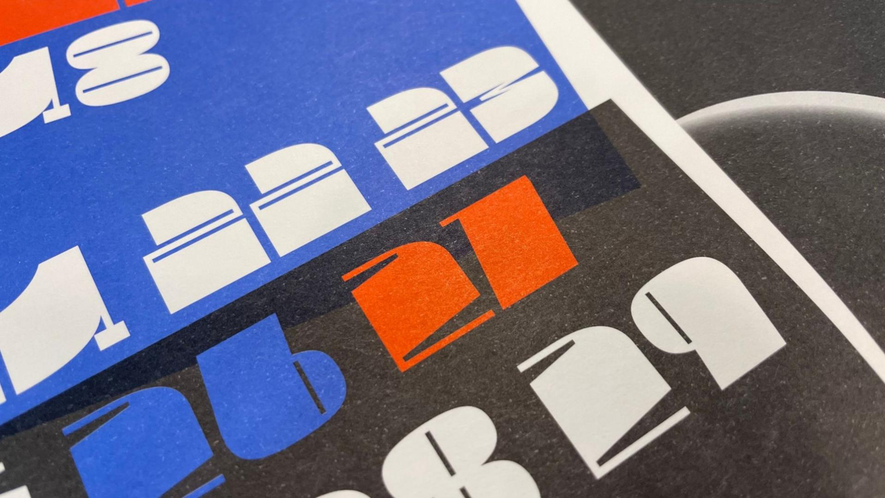
In the end, what we had worried about did happen. If overlapping objects in the print file are not cleaned up properly, the colors end up layering like in the image below. It was something we missed on the monitor and the print shop caught during printing. I hope those reading this article don’t make the same mistake I did…
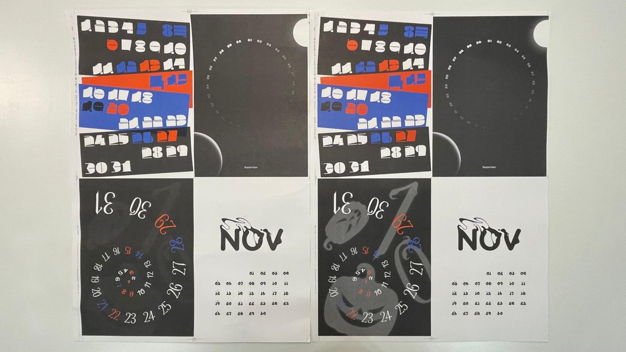
Wiping away my tears, I took comfort in the fact that it was still a point where things could be fixed, and went back to the print shop. While revising the August calendar, I made small adjustments to September and October as well. When using light colors with fewer halftone dots*, the printed result has much less contrast than it appears on screen. Following the press operator’s advice to work slightly brighter than the desired on-screen value, I adjusted the color values. This time, the press check was completed without issue.
After the revisions, can you see how the ribbon-like form of September’s Dal-muri and October’s pumpkin became clearer? From here on, the process is out of my hands and rests with the print shop—I can only wait and hope everything arrives safely.
*The numbers that follow CMYK values, such as K10, C50, or M100, indicate halftone dot percentages. The lower the number, the fewer the dots and the lighter the color appears. In the printing industry, colors with halftone values from 1–99% are sometimes referred to, using a Japanese term, as ami (あみ).
Before & After
December, the Real Final.arw
Now comes the climax toward the finish line—the product shoot is all that remains. Because the images were needed for the event page’s operational design, we first discussed with related teams what specific shots would be required. We set the direction around usage shots that show the goods in use, along with scenes that convey the mood of special occasions. Decoration details were to be decided on site, and with that plan in place, we headed to the studio.
This shoot was carried out by an in-house Sandoll photography team made up of skilled colleagues. Filming continued from early morning through the entire afternoon.
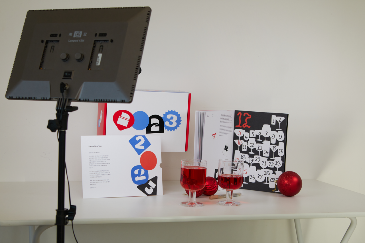
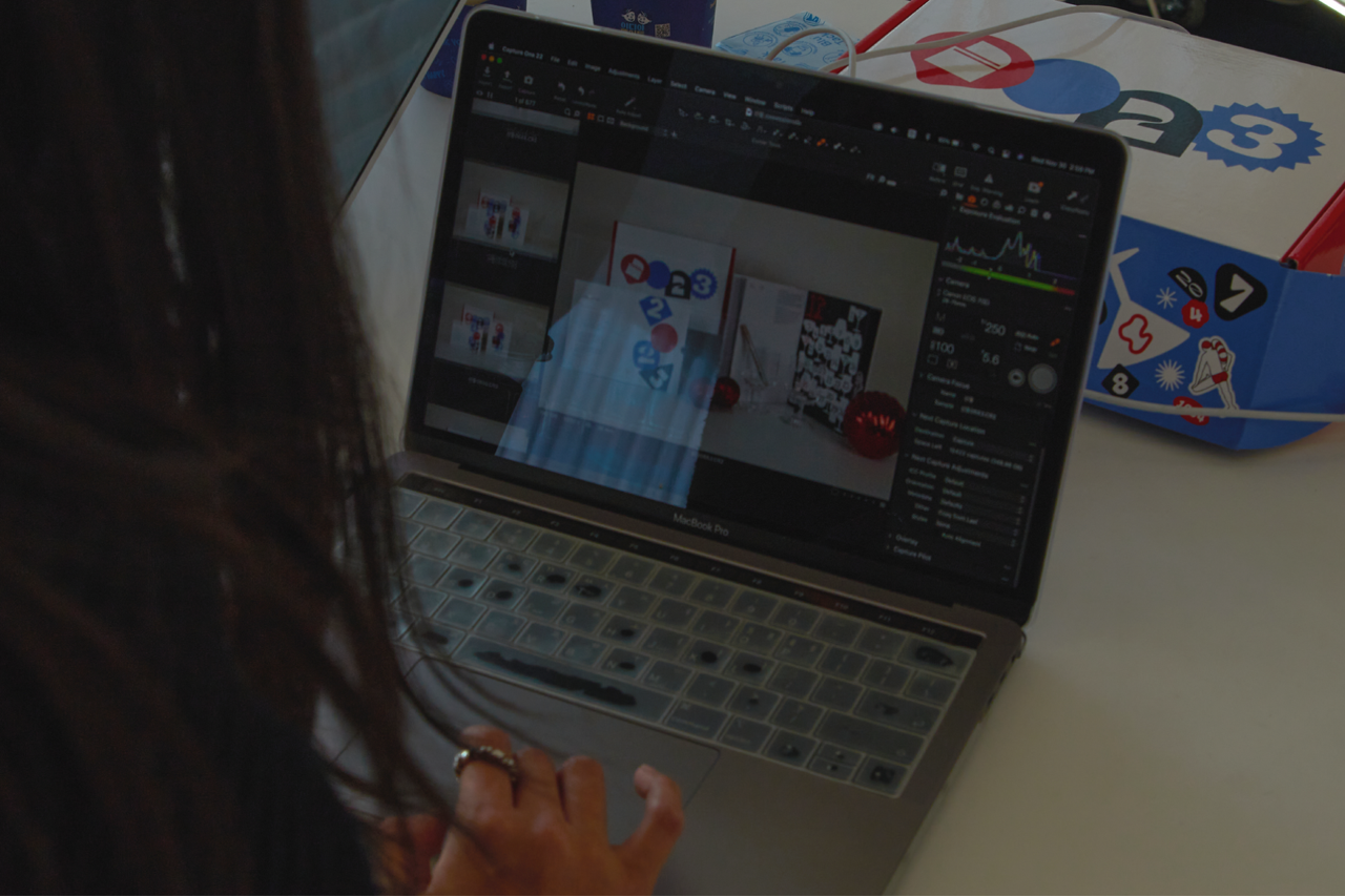
Because the photography team was made up of members with a strong planning-oriented mindset, the shoot progressed smoothly as scheduled, and the final selections were delivered to the UX team without issue. At last, my role came to an end. Still, it feels too early to relax before the launch. It is not truly over until it is over, so I wait for the real final version with a mix of anticipation and nerves.
(Aren’t you curious to see the real final outcome after all those long steps? You can find out how the UX team delivered the message of gratitude through the Link.)
Why We Look Forward to the New Year
With its connection to the Sandoll Cloud Select Shop and the physical scale of the goods, the <2023 New Year’s Greeting Goods> grew significantly compared to the previous year. A larger scale meant more details to care for, but it was also a project full of learning. Helping one another and receiving help in return reminded me that work is never done alone. There is a lingering sense of wistfulness, but the New Year always comes again.
Wishing everyone a happy 2023—and see you again.
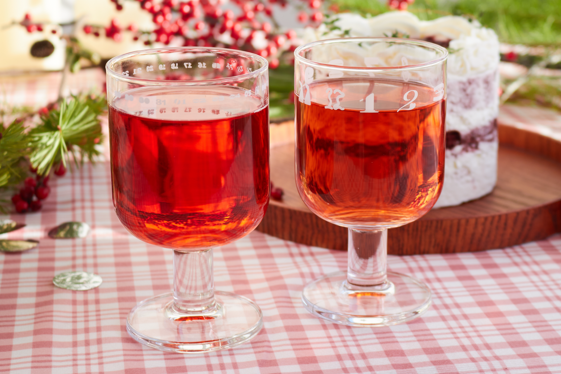
Why We Look Forward to the New Year
Compared to last year, the <2023 New Year’s Greeting Goods> expanded in scale through its connection with the Sandoll Cloud Select Shop and the increased physical size of the goods. With the larger scope came more details to consider, but it was also a project rich in learning. Giving and receiving help along the way once again reminded us that work is never done alone. There is a lingering sense of wistfulness—but the New Year will come again.
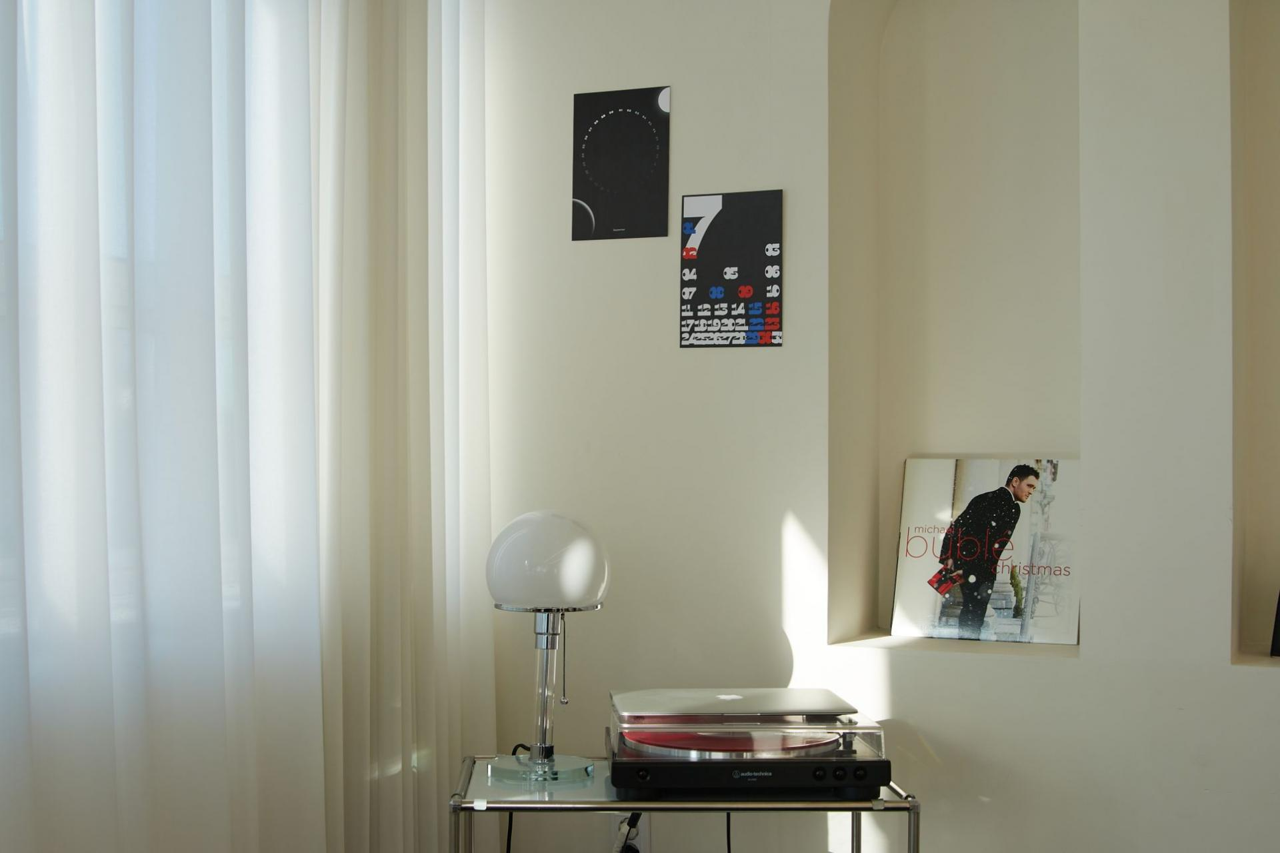
Wishing everyone a happy new year. See you again!
Credit
Overall Lead : Kim Jin-hee (김진희)
Planning Team : Kim Jin-hee (김진희), Kim Yeon-a (김연아), Kim Yeo-reum (김여름)
Production Team : Kim Yeo-reum (김여름), Jeong Tae-young (정태영), Park Bu-mi (박부미), Jang Ga-seok (장가석)
Calendar・Font Design : Kang Min-jae (강민재), Zhang Jiashuo (장가석), Lim Chang-seop (임창섭), Ma Gi-chan (마기찬), Jeong Tae-young (정태영), Lim Hye-eun (임혜은), Lee Soo-hyun (이수현), Kim Seul-gi (김슬기), Kim Yeo-reum (김여름), Lee Yu-bin (이유빈), Jang Mi (장미), Park Bu-mi (박부미)
Printing・Production : Cheongsan Printing (청산인쇄)
Font Generation : Shin Ye-rim (신예림), Lim Chang-seop (임창섭)
Text : Lee Yong-ho (이용호)
English Translation : Kim Yeon-a (김연아)
Photographer : Kim Yeon-a (김연아)
Photography Team : Park Seung-hyeon (박승현), Kim Yeo-reum (김여름), Jeong Tae-young (정태영), Zhang Jiashuo (장가석)
Operations Planning : Kim Soo-yeon (김수연), Lee So-yoon (이소윤)
Operations Design : Jeong Hyo-jeong (정효정)
Operations Development : Park Hyo-jeong (박효정), Yoon Hyun-jin (윤현진), Jang Na-rae (장나래)



Insight
We Did Everything We Wanted
<2023 New Year’s Greeting Goods> was carried out with a high level of autonomy for the designers who participated in the project. Perhaps because of that, we approached it more boldly than usual. In particular, the project was especially meaningful because participants who were not font designers were able to create fonts for the first time in their lives. Things that might have felt hard to attempt alone seemed to become possible when done together. From planning at the start of the year to the launch at the end of the year, we’d like to share the story of creating the New Year’s Greeting Goods—a journey of constant momentum.
March, Looking Back at 2022
The BX Team has been involved since the production of the <2022 New Year’s Greeting Goods>. We joined partway through after being asked to support packaging and other printed materials. Because we came in after much of the work was already underway, it was disappointing that we could only contribute in a limited way. We also felt that the addition of unplanned items reduced overall consistency, which stood out as an area for improvement.
To address these points, the <2023 New Year’s Greeting Goods> project was approached more systematically, with the BX Team participating from the planning stage onward.
<2022 New Year’s Greeting Goods> Seasonal Calendar
April, What Should We Make?
<2022 New Year’s Greeting Goods> used the medium of a calendar to showcase lettering work. For 2023, the project moved forward as an extension of that idea, with the direction set to create the numerals used in the calendar as a variable font. Ideation for the goods also began in line with this direction.
<2022 New Year’s Greeting Goods> Seasonal Calendar Hanro(寒露)
*Hanro (寒露) is the 17th of the 24 solar terms. Literally meaning “cold dew,”
it refers to the period when the air grows colder and dew forms just before it turns into frost.
We saw the numerals in a calendar as carrying a strong sense of “commemoration.” With that in mind, for 2023 we wanted to convey the message that “every day is a celebration,” wishing that both ordinary days and special days alike could be happy ones. We also wanted to express, through a 365-day calendar, that Sandoll is present alongside those happy days.
Following this line of thought, we decided to create a goblet as the goods—something that can be used on special occasions while also allowing users to mark and celebrate their own personal anniversaries.
June, Design Begins!
We shared the overall direction with the designers participating in the <2023 New Year’s Greeting Goods> project and assigned each person a month. To avoid overlapping font concepts, we gathered regularly for feedback sessions, sharing drafts and exchanging ideas along the way. Centered on the overarching theme of “anniversaries,” the goods were interpreted from various perspectives—special days, seasons, and cycles—resulting in a wide range of outcomes.
For those curious about the font and calendar designs for each month, detailed explanations can be found in the previous article (Link).
September, the First Question
The New Year’s Greeting Goods, launched at the end of the year, are distributed not only by Sandoll but also through Sandoll Cloud. While both brands share the same purpose of expressing gratitude, there is a difference: Sandoll, as a font foundry, carries a research-oriented character, while Sandoll Cloud needs to reflect its nature as a platform. Ideally, creating separate goods for each brand would clarify each message, but within limited conditions, we had to find another approach.
To minimize confusion, we eliminated all colors except the two brand colors. By carefully balancing Sandoll’s red and Sandoll Cloud’s blue, we aimed to find a design in which both could coexist. We also hoped that, as users looked through the goods, they would naturally be reminded of both Sandoll and Sandoll Cloud.
In terms of composition, we kept the goods items the same, but differentiated the thank-you cards that conveyed the messages more directly.
October, the Second Question
We needed a way to bring everything together while allowing the unique appeal of each font to come through. At the same time, we wanted to show that engaging compositions could be created using numeral fonts alone.
There were many ideas. We explored approaches that emphasized the presence of individual fonts, layouts where multiple fonts blended together, and compositions that featured the goods more directly. After discussions with the production team, we aligned on a direction in which multiple fonts could coexist while still expressing the distinct character of each form. We also felt this approach could effectively capture the lively, bustling atmosphere of the year-end and New Year season.
<2023 New Year’s Greeting Goods> package concepts
November, a Nerve-Racking Print Check
At last, it was time for the press check. It was a print shop I had visited many times, yet my nerves never seem to fade. I arrived with a pounding heart.
At the shop, the press operator refers to the Pantone color chips we provided in advance and mixes the inks for printing. “Please increase the density,” “Please add more yellow.” After several adjustments like these, the final colors are fixed and production begins. With full-color prints, ink can sometimes appear uneven, or small bits of paper dust may stick to the rollers and show up as white specks. That is why it is necessary to stay right beside the operator and inspect everything carefully, step by step.
In the end, what we had worried about did happen. If overlapping objects in the print file are not cleaned up properly, the colors end up layering like in the image below. It was something we missed on the monitor and the print shop caught during printing. I hope those reading this article don’t make the same mistake I did…
Wiping away my tears, I took comfort in the fact that it was still a point where things could be fixed, and went back to the print shop. While revising the August calendar, I made small adjustments to September and October as well. When using light colors with fewer halftone dots*, the printed result has much less contrast than it appears on screen. Following the press operator’s advice to work slightly brighter than the desired on-screen value, I adjusted the color values. This time, the press check was completed without issue.
After the revisions, can you see how the ribbon-like form of September’s Dal-muri and October’s pumpkin became clearer? From here on, the process is out of my hands and rests with the print shop—I can only wait and hope everything arrives safely.
*The numbers that follow CMYK values, such as K10, C50, or M100, indicate halftone dot percentages. The lower the number, the fewer the dots and the lighter the color appears. In the printing industry, colors with halftone values from 1–99% are sometimes referred to, using a Japanese term, as ami (あみ).
Before & After
December, the Real Final.arw
Now comes the climax toward the finish line—the product shoot is all that remains. Because the images were needed for the event page’s operational design, we first discussed with related teams what specific shots would be required. We set the direction around usage shots that show the goods in use, along with scenes that convey the mood of special occasions. Decoration details were to be decided on site, and with that plan in place, we headed to the studio.
This shoot was carried out by an in-house Sandoll photography team made up of skilled colleagues. Filming continued from early morning through the entire afternoon.
Because the photography team was made up of members with a strong planning-oriented mindset, the shoot progressed smoothly as scheduled, and the final selections were delivered to the UX team without issue. At last, my role came to an end. Still, it feels too early to relax before the launch. It is not truly over until it is over, so I wait for the real final version with a mix of anticipation and nerves.
(Aren’t you curious to see the real final outcome after all those long steps? You can find out how the UX team delivered the message of gratitude through the Link.)
Why We Look Forward to the New Year
With its connection to the Sandoll Cloud Select Shop and the physical scale of the goods, the <2023 New Year’s Greeting Goods> grew significantly compared to the previous year. A larger scale meant more details to care for, but it was also a project full of learning. Helping one another and receiving help in return reminded me that work is never done alone. There is a lingering sense of wistfulness, but the New Year always comes again.
Wishing everyone a happy 2023—and see you again.
Why We Look Forward to the New Year
Compared to last year, the <2023 New Year’s Greeting Goods> expanded in scale through its connection with the Sandoll Cloud Select Shop and the increased physical size of the goods. With the larger scope came more details to consider, but it was also a project rich in learning. Giving and receiving help along the way once again reminded us that work is never done alone. There is a lingering sense of wistfulness—but the New Year will come again.
Wishing everyone a happy new year. See you again!
Credit
Overall Lead : Kim Jin-hee (김진희)
Planning Team : Kim Jin-hee (김진희), Kim Yeon-a (김연아), Kim Yeo-reum (김여름)
Production Team : Kim Yeo-reum (김여름), Jeong Tae-young (정태영), Park Bu-mi (박부미), Jang Ga-seok (장가석)
Calendar・Font Design : Kang Min-jae (강민재), Zhang Jiashuo (장가석), Lim Chang-seop (임창섭), Ma Gi-chan (마기찬), Jeong Tae-young (정태영), Lim Hye-eun (임혜은), Lee Soo-hyun (이수현), Kim Seul-gi (김슬기), Kim Yeo-reum (김여름), Lee Yu-bin (이유빈), Jang Mi (장미), Park Bu-mi (박부미)
Printing・Production : Cheongsan Printing (청산인쇄)
Font Generation : Shin Ye-rim (신예림), Lim Chang-seop (임창섭)
Text : Lee Yong-ho (이용호)
English Translation : Kim Yeon-a (김연아)
Photographer : Kim Yeon-a (김연아)
Photography Team : Park Seung-hyeon (박승현), Kim Yeo-reum (김여름), Jeong Tae-young (정태영), Zhang Jiashuo (장가석)
Operations Planning : Kim Soo-yeon (김수연), Lee So-yoon (이소윤)
Operations Design : Jeong Hyo-jeong (정효정)
Operations Development : Park Hyo-jeong (박효정), Yoon Hyun-jin (윤현진), Jang Na-rae (장나래)