Insight
Sandoll began with the <2021 New Year’s Greeting Goods> and has gradually expanded their scale, sharing messages of gratitude with those who have supported us. As 2023 approaches, we would like to share with you the story of how Sandoll chose to express that gratitude.
Regrets from 2022
Sandoll’s designers brought the <2022 New Year’s Greeting Goods>, the Seasonal Calendar, to a satisfying close. At the same time, however, a few lingering regrets remained.
The first was that we were unable to include the intent and direction behind the project within the goods themselves. While the 24 seasonal divisions were well expressed through lettering, the small size of the piece made it difficult to convey the underlying intention. This led us to think that, in the following year, we should design the goods in a way that could better embody both concept and intent.
The second regret was the lack of opportunity for users to experience the goods through actual use. As a lettering-based work, it worked well as something to be appreciated like a single artwork, but we felt there were limits to the range of experiences it could offer. One of the strengths of font design, we believe, lies in its ability to create diverse experiences through use. We felt that expressing our gratitude by fully leveraging this strength would be even more meaningful.
Even before the frogs awoke from hibernation, we began planning the <2023 New Year’s Greeting Goods>, reflecting on the regrets of the previous year. There is no project more important than finding a better way to express our gratitude to those who walk alongside Sandoll.
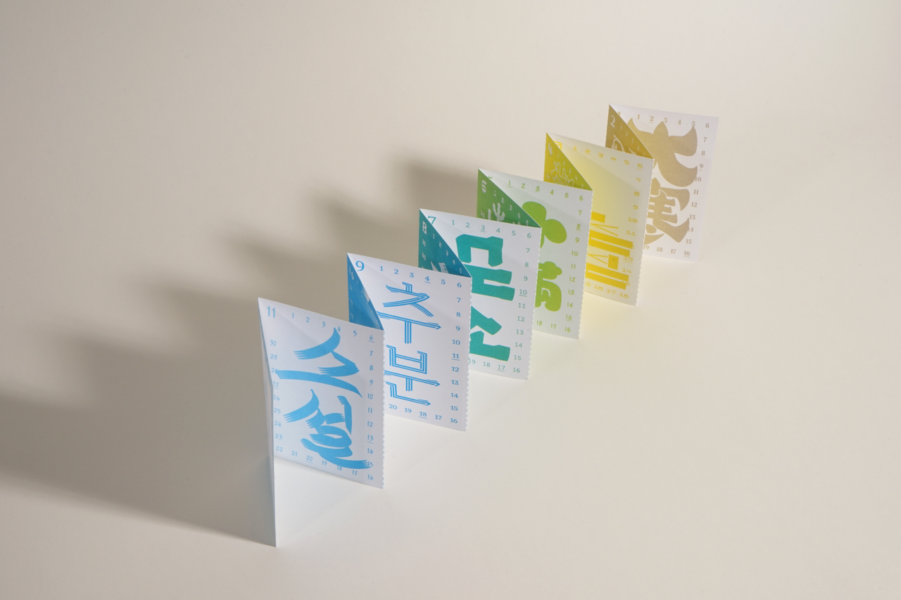
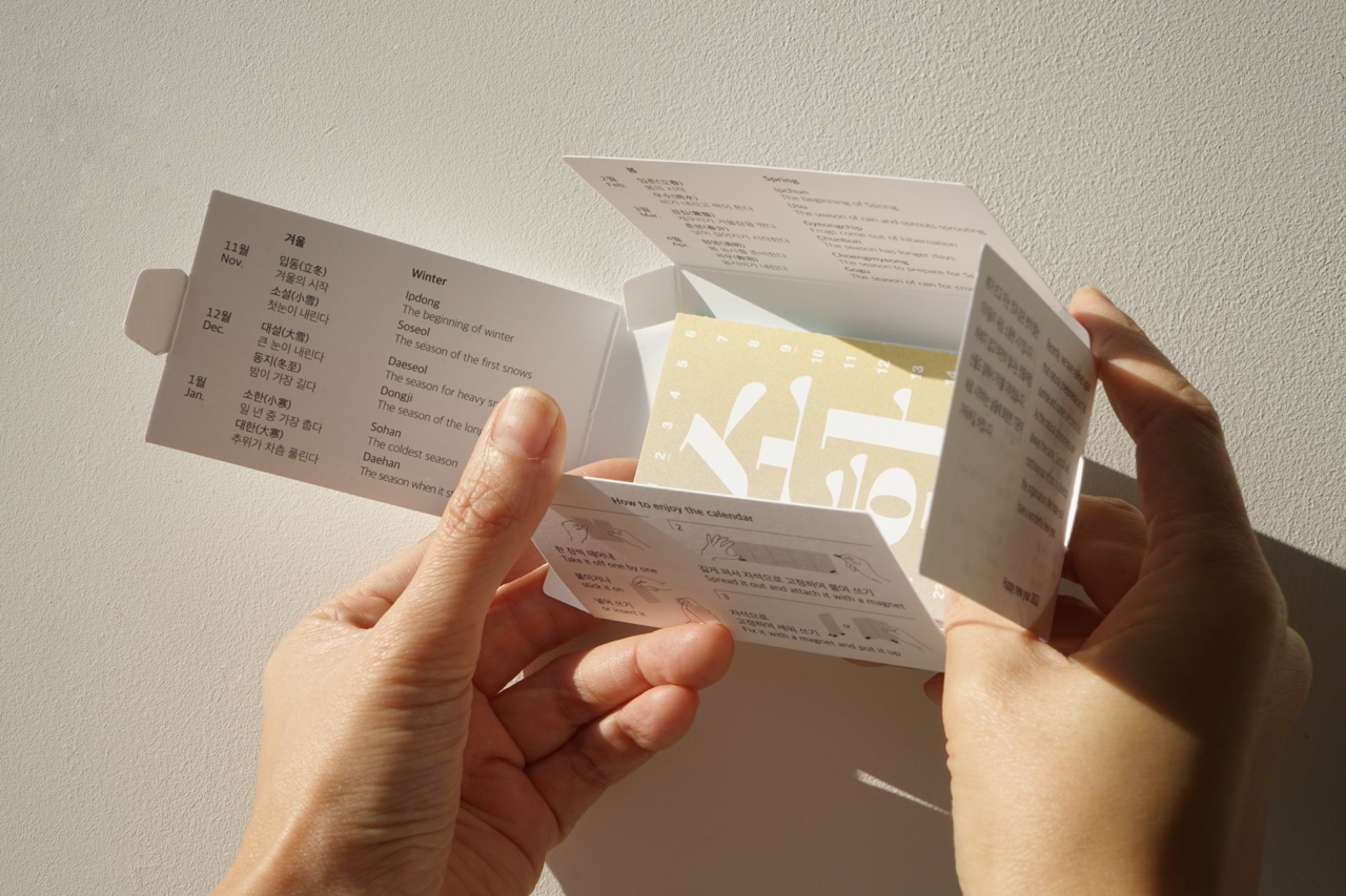
<2022 New Year’s Greeting Goods – Seasonal Calendar>
Beginning the Planning
What Sandoll takes the greatest pride in is its fonts. Rather than treating them as ordinary fonts, however, we decided to consider how they could offer users more diverse and distinctive experiences. This led us to variable fonts. Unlike conventional fonts, which contain a single weight or style, variable fonts can encompass multiple weights and styles within one font, allowing for dynamic variation. We felt that by using this feature, users could directly experience the many experiments and attempts made by designers.
Another key element we could not overlook was the calendar. It is a type of goods we want to create every year, as we see it as an effective medium for closing out one year and beginning the next with renewed energy.
With this in mind, for the <2023 New Year’s Greeting Goods>, we agreed to first develop a variable numeral font, and then use that font to create a calendar along with various other goods.
Production, and the joy of feedback
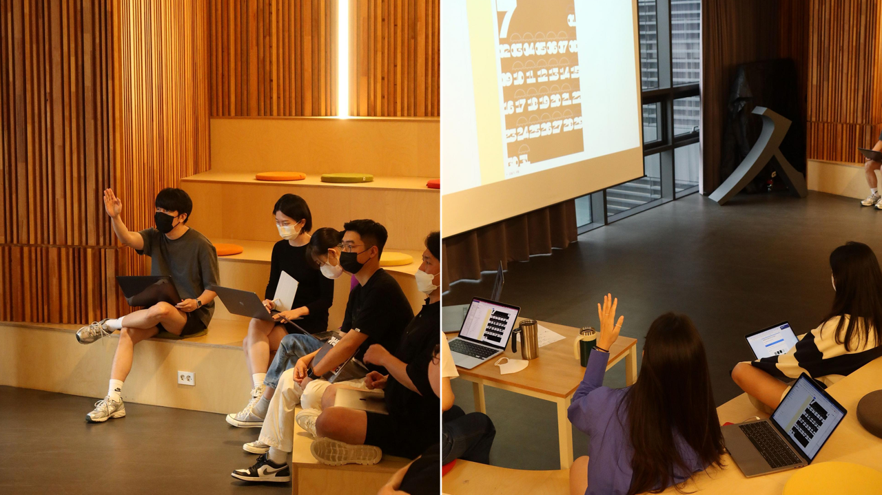
Once the planning was finalized, we moved straight into production. Twelve Sandoll designers each created a font and calendar suited to a specific month. Not only font designers, but also UX designers and brand designers voluntarily participated in the project*, approaching the font from a wide range of perspectives. Over the course of this process, four rounds of feedback sessions were held. We explained our design intentions, shared the difficulties and questions we were facing, suggested solutions to one another, and offered encouragement—gradually refining the designs step by step.
*Sandoll freely provides internal members with opportunities to create fonts. Our doors are wide open to anyone who wants to take part.
To some, these feedback sessions might seem unnecessary. From my position overseeing the <2023 New Year’s Greeting Goods>, I was the one who had gathered already-busy designers, and there were many moments when the thought crossed my mind: “Am I wasting their valuable time?” With so many participants, the sessions also grew longer, adding to the burden.
However, when working on design, it is easy to become too absorbed in one’s own perspective, lose objectivity, or begin to doubt the direction. In moments like these, sharing thoughts with fellow designers can ease concerns and bring forth good ideas that one might never reach alone. For the sake of these precious moments, I could not give up on the feedback sessions.
Design complete, and experiencing design at 200%
Through this process, a total of 12 families and 39 styles of fonts and calendars were completed. Filled with the care and dedication of many designers, the fonts—and the calendars—seem to shine all the more brightly.
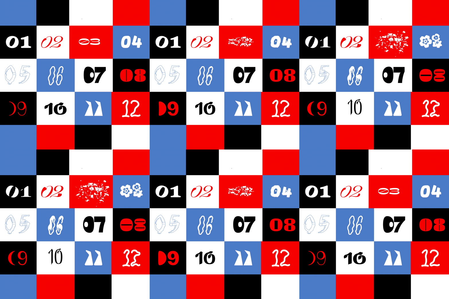
If you know the intent behind these works and the concepts they are based on, the user experience will expand by 200%, won’t it? We thought you might be curious, so we have included the concepts and production intentions for each piece below. By reading the designers’ intentions and exploring the works with that context in mind, you can engage with the designs more actively. (Link)
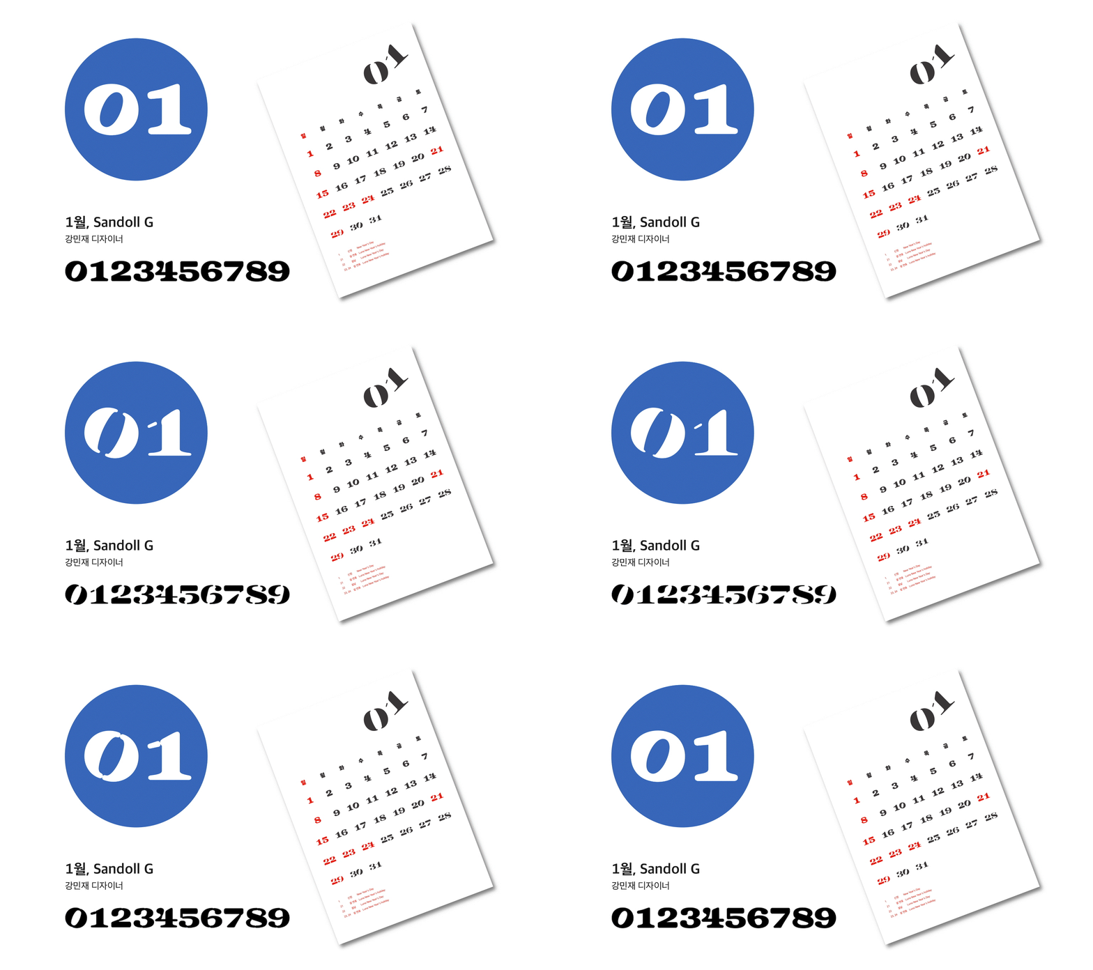
January, 「Sandoll G」
A new year has begun. Happy New Year. A newly starting 2023—and January. In Korea, it is still a cold winter, and soon spring will arrive. Then summer will come, followed by autumn, and winter once again. On the Earth we live on, the year changes in a cycle of 365 days, and each month passes in a cycle of 28 to 31 days, bringing changes in the seasons. Why do the seasons change in this way?
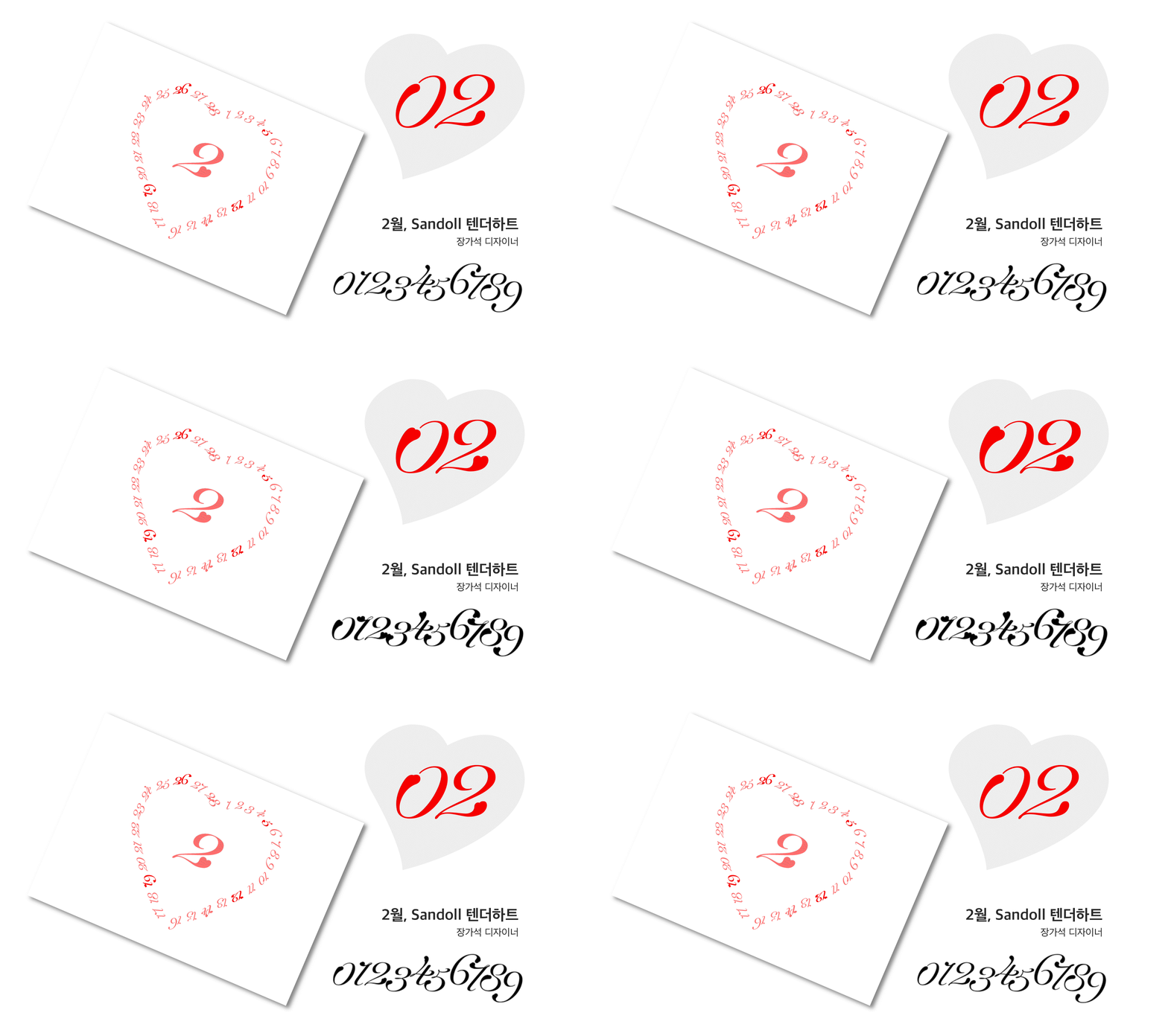
February, 「Sandoll Tender Heart」
In February, the month of Valentine’s Day, will lovely hearts appear on the calendar as well? 「Tender Heart」 is an old-style numeral font rich in soft curves. The Shy weight features rounded tails, creating a cute yet gentle impression. As you increase the Heart axis of the variable font, you will discover numerals with bold expressions, where hidden hearts gradually emerge. We hope 「Tender Heart」 fills your days with love.
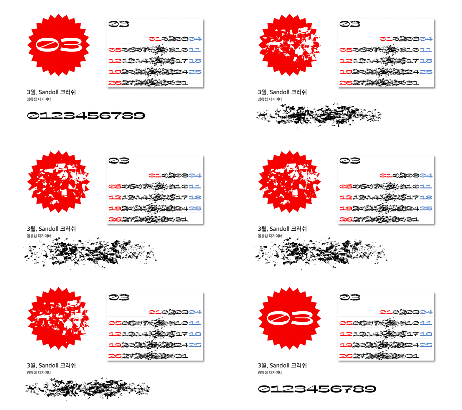
March, 「Sandoll Crush」
We expressed in numerals the office worker’s mentality—shattering every weekday morning on the commute, then miraculously recovering as days off approach. Using web variable features, try breaking the numerals apart in a more vivid way.
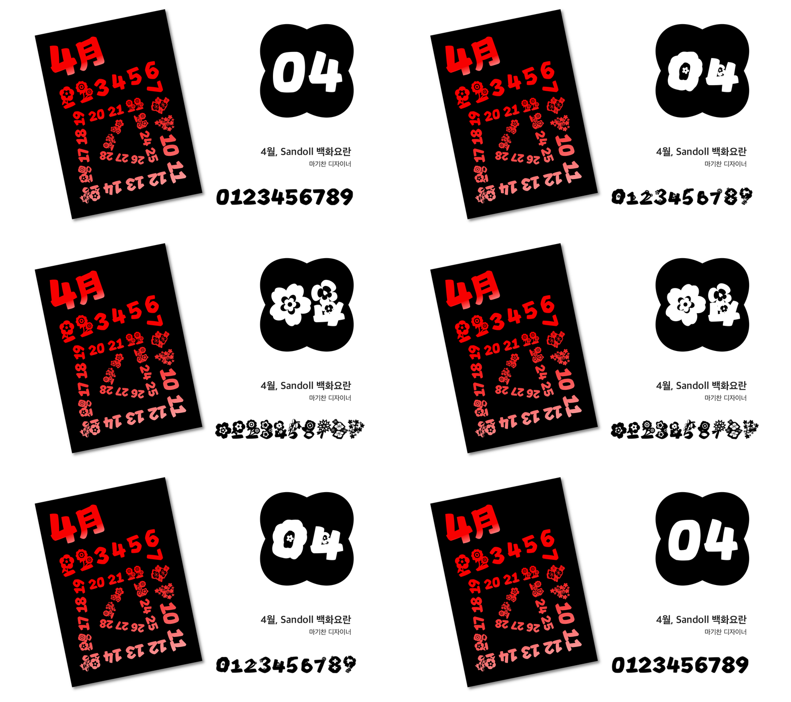
April, 「Sandoll Baekhwayoran」
April is the season when flowers truly begin to bloom. We depicted wildflowers that had been huddled through winter pushing up through the soil and bursting into bloom in all kinds of forms.
At the same time, the sight of numerals turning into flowers felt subtly grotesque. So we designed the calendar with an eerie, unstable spring mood—an inversion of the usual sentiment. We also added the idea that on weekends, the numerals bloom into flowers, inviting you to forget the time and go flower viewing that day.
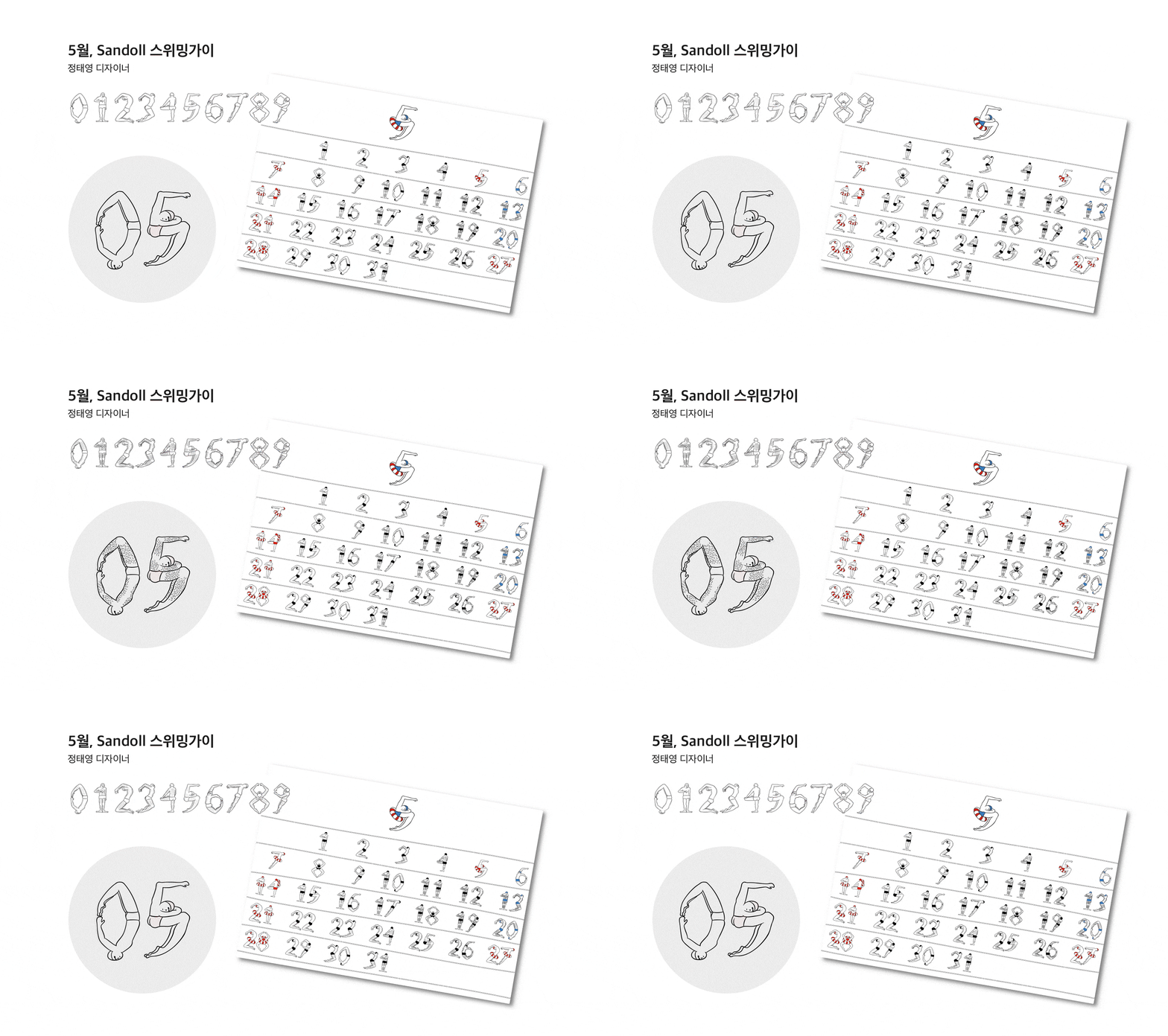
May, 「Sandoll Swimming Guy」
May marks the beginning of summer.
Before jumping into the sea, it is essential to ready both body and mind—especially if the day is a special one for you. 「Swimming Guy」, which has been waiting for summer, allows the font’s form to change along two axes: Swimming and No Shaving. What kind of transformations appear is something you can discover for yourself.
And by finding the hidden special characters, help 「Swimming Guy」—who cannot swim—take the plunge.
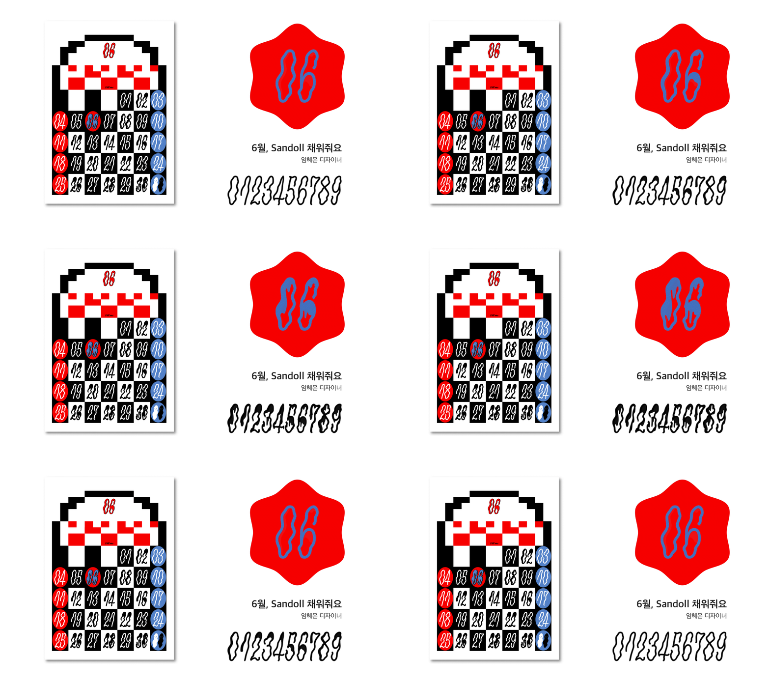
June, 「Sandoll Fill Me Up」
When one side of your heart feels empty, what do you fill it with? Drinks and conversation. Sweet, spicy, and salty food, and an episode of a variety show. Like thick concrete slowly and stickily flowing down to fill a mold, days of emptiness, sparsely filled with other things.
Through the imagery of numerals and the calendar, we wanted to show this feeling. I also slipped in a bit of my own taste—I like passing the time by watching horror films. With June’s font, 「Fill Me Up」, try checking your own level of fullness.
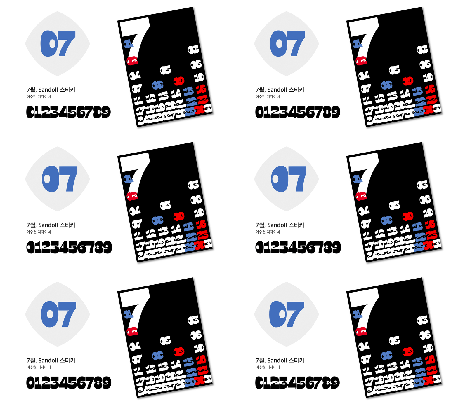
July, 「Sandoll Sticky」
「Sandoll Sticky」 captures the sticky mood of July during the rainy season. The side bearings of the characters were set tightly so that they cling to one another, and the letterforms were designed as dense, gapless shapes to heighten the heavy, sticky feeling. The variable axes are divided into Left and Right; by mixing the two extreme values, you can use numerals that adhere in various ways from side to side.
The July calendar designed with 「Sticky」 makes use of how two-digit numerals stick together. In particular, the characters cling more tightly toward the end of the month, reflecting the sense of July growing increasingly humid.
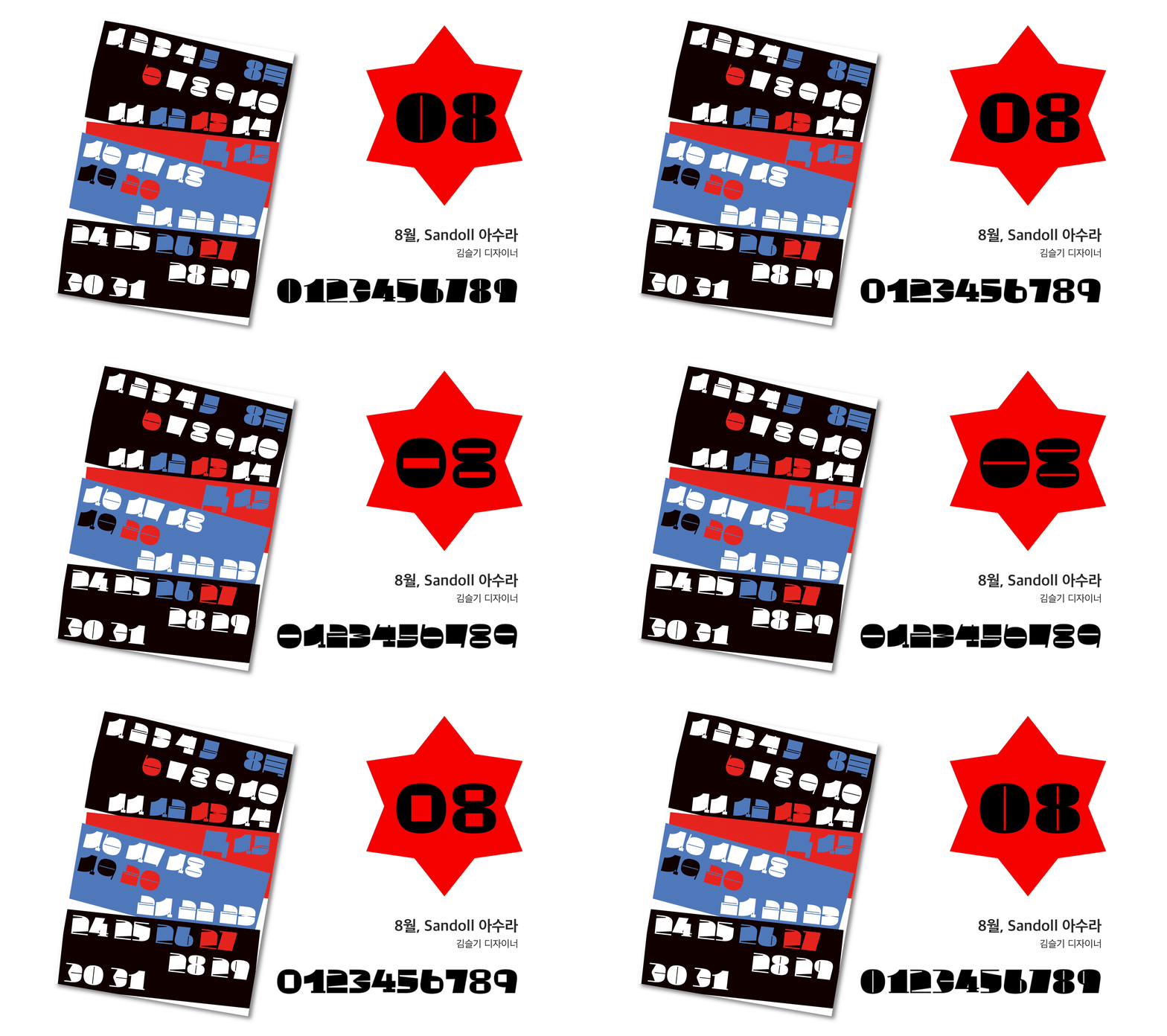
August, 「Sandoll Asura」
August is a dual-natured month—the hottest time of the year, yet also when the heat begins to ease with Ipchu, the start of autumn. We expressed this compelling character of August through refreshing stroke contrast.
Asura comes in two versions, Contrast and Reversed Contrast, where horizontal and vertical strokes invert against each other, carrying a charm reminiscent of Count Asura. The font’s name was also taken from this character.
With the cool stroke contrast of 「Asura」, let’s weather the summer heat together. We also quietly included a Geon–Gon–Gam–Ri glyph for August 15, Liberation Day.
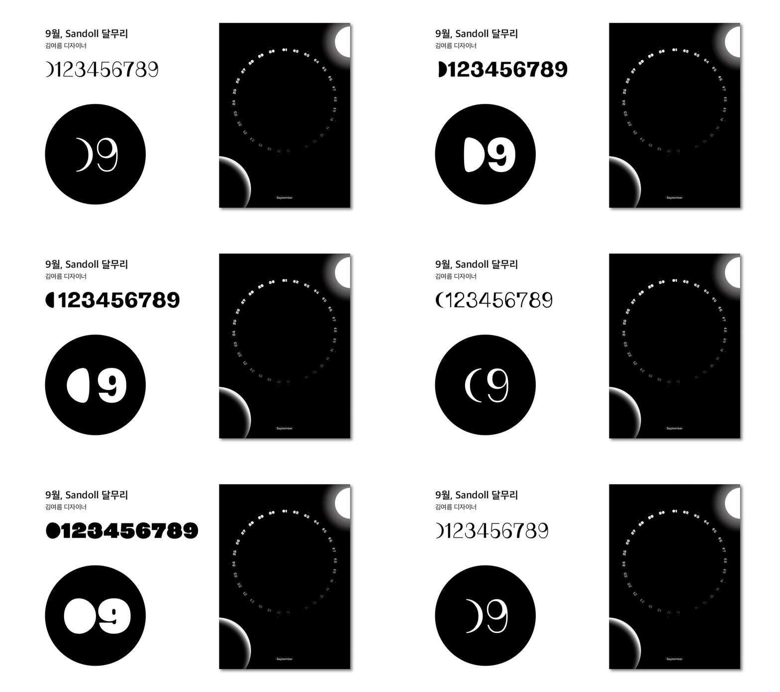
September, 「Sandoll Dal-muri」
We captured the cycle of the moon as it waxes and wanes. I see the moon as holding both coolness and warmth, and wanted to express visual temperature through the fullness of the full moon and the sharpness felt in the crescent moon. This progression—from new moon to full moon to crescent—can be clearly seen especially in the numeral ‘0’.
In the calendar, we applied the variable font in accordance with the actual lunar cycle. When you happen to look up at the night sky and feel the subtle experience of moonlight, we hope you can sense that same quiet feeling through the calendar as well.
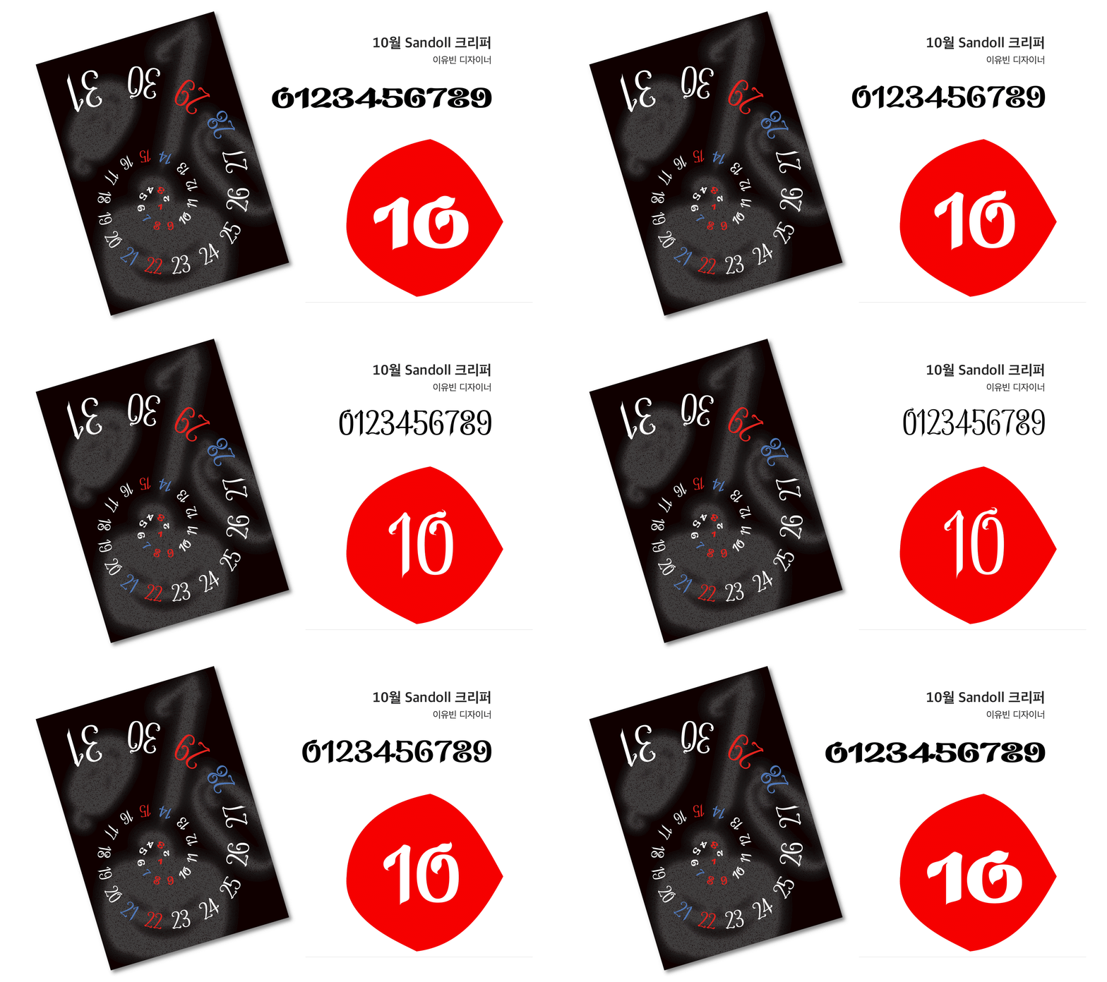
October, 「Sandoll Creeper」
October grows cooler and drier by the day. After passing through oily, lush days, don’t be too sad watching the leaves dry and wither—they are rushing toward their festival, Halloween!
We created the numerals using the motif of vines that wither in a strange yet beautiful way. Cute pumpkin dingbats were also made, so enjoy a cute and spooky Halloween with the 「Creeper」 font. Trick or Treat!
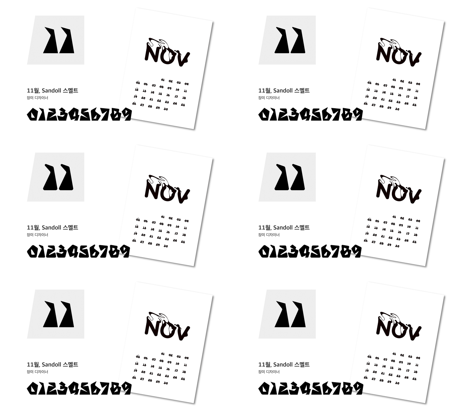
November, 「Sandoll Smelt」
Autumn is gold—and gold is autumn. When fall arrives, it’s exciting to think about pulling out cozy sweaters and gold items. That’s why November’s font draws inspiration from gold.
The variable font expresses the process of melting rough, jagged gold ore and refining it into smooth, rounded gold. From the sharp Raw of 「Smelt」 to the rounded Refined, you can experience both moods.
We hope you enjoy a sparkling November with 「Smelt」.
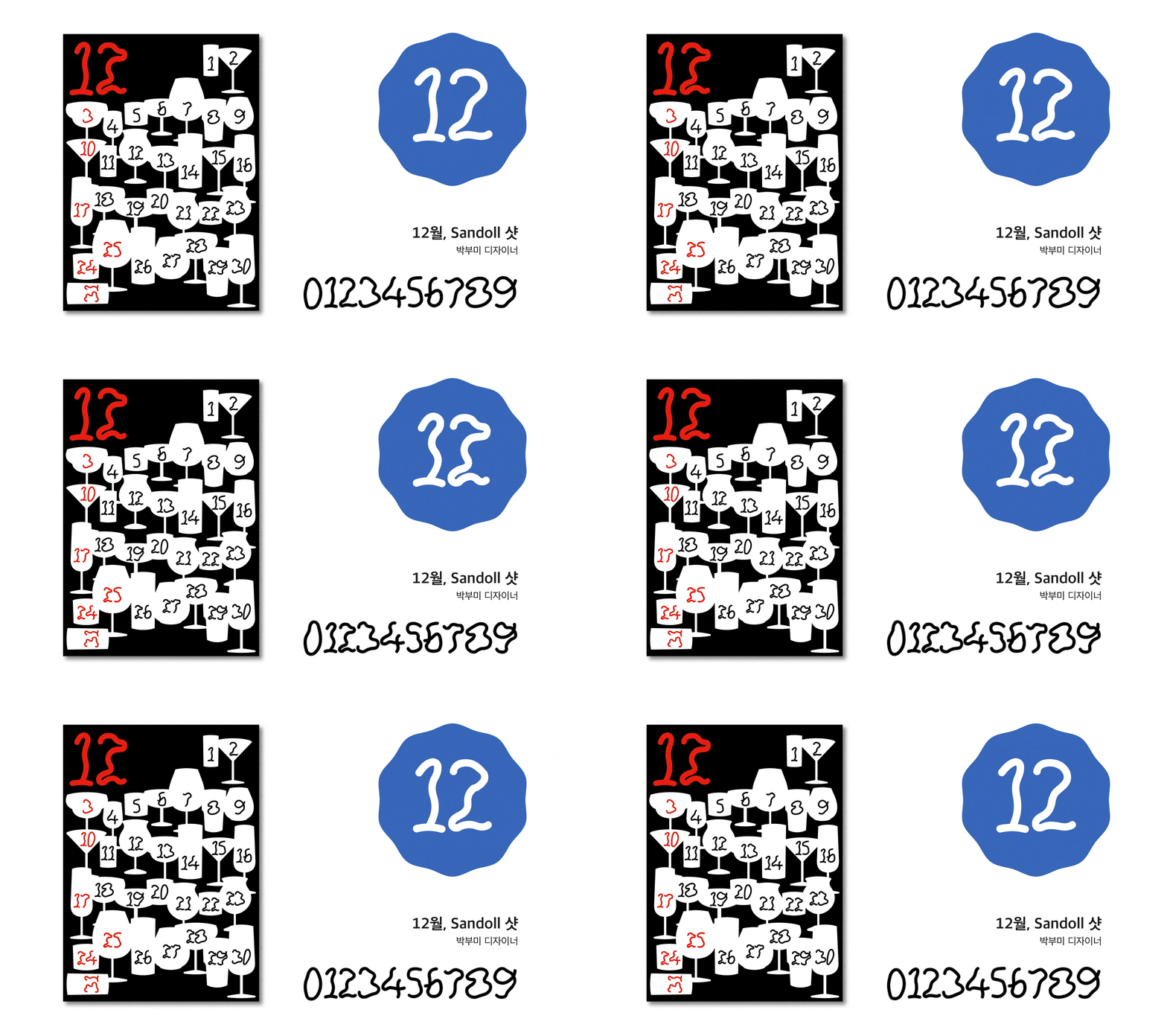
December, 「Sandoll Shot」
December’s numeral font is called 「Shot」. At year’s end, with all kinds of gatherings, there are naturally more chances to drink different kinds of alcohol or beverages. The numerals of 「Shot」 express the feeling of growing unsteady with each glass—one shot, then another. As you move from First to Last, the forms become increasingly wobbly, like the sensation of getting tipsy.
Let go of tension, catch up on postponed plans, wrap up the year, and wait for the new one with a light, lifted heart. But remember—excessive drinking is harmful to your health.
Wrapping up the font and calendar design
Working on <2023 New Year’s Greeting Goods> reminded me how challenging it can be to collaborate with many people on a single project. With everyone having different needs, gathering and coordinating them was not easy—but that also made the sense of achievement all the greater. Through this article, I would like to express my sincere thanks to all the designers who worked so hard to bring it to completion.
You might think that this marks the end of the goods project, but there are still many twists and turns left before <2023 New Year’s Greeting Goods> is truly finished. In the next article (link), you can see how these designs went through production and finally made their way into the world. We hope you’ll stay tuned.
Credit
Overall Lead : Kim Jin-hee (김진희)
Planning Team : Kim Jin-hee (김진희), Kim Yeon-a (김연아), Kim Yeo-reum (김여름)
Production Team : Kim Yeo-reum (김여름), Jeong Tae-young (정태영), Park Bu-mi (박부미), Jang Ga-seok (장가석)
Calendar・Font Design : Kang Min-jae (강민재), Zhang Jiashuo (장가석), Lim Chang-seop (임창섭), Ma Gi-chan (마기찬), Jeong Tae-young (정태영), Lim Hye-eun (임혜은), Lee Soo-hyun (이수현), Kim Seul-gi (김슬기), Kim Yeo-reum (김여름), Lee Yu-bin (이유빈), Jang Mi (장미), Park Bu-mi (박부미)
Printing・Production : Cheongsan Printing (청산인쇄)
Font Generation : Shin Ye-rim (신예림), Lim Chang-seop (임창섭)
Text : Lee Yong-ho (이용호)
English Translation : Kim Yeon-a (김연아)
Photographer : Kim Yeon-a (김연아)
Photography Team : Park Seung-hyeon (박승현), Kim Yeo-reum (김여름), Jeong Tae-young (정태영), Zhang Jiashuo (장가석)
Operations Planning : Kim Soo-yeon (김수연), Lee So-yoon (이소윤)
Operations Design : Jeong Hyo-jeong (정효정)
Operations Development : Park Hyo-jeong (박효정), Yoon Hyun-jin (윤현진), Jang Na-rae (장나래)



Insight
Sandoll began with the <2021 New Year’s Greeting Goods> and has gradually expanded their scale, sharing messages of gratitude with those who have supported us. As 2023 approaches, we would like to share with you the story of how Sandoll chose to express that gratitude.
Regrets from 2022
Sandoll’s designers brought the <2022 New Year’s Greeting Goods>, the Seasonal Calendar, to a satisfying close. At the same time, however, a few lingering regrets remained.
The first was that we were unable to include the intent and direction behind the project within the goods themselves. While the 24 seasonal divisions were well expressed through lettering, the small size of the piece made it difficult to convey the underlying intention. This led us to think that, in the following year, we should design the goods in a way that could better embody both concept and intent.
The second regret was the lack of opportunity for users to experience the goods through actual use. As a lettering-based work, it worked well as something to be appreciated like a single artwork, but we felt there were limits to the range of experiences it could offer. One of the strengths of font design, we believe, lies in its ability to create diverse experiences through use. We felt that expressing our gratitude by fully leveraging this strength would be even more meaningful.
Even before the frogs awoke from hibernation, we began planning the <2023 New Year’s Greeting Goods>, reflecting on the regrets of the previous year. There is no project more important than finding a better way to express our gratitude to those who walk alongside Sandoll.
<2022 New Year’s Greeting Goods – Seasonal Calendar>
Beginning the Planning
What Sandoll takes the greatest pride in is its fonts. Rather than treating them as ordinary fonts, however, we decided to consider how they could offer users more diverse and distinctive experiences. This led us to variable fonts. Unlike conventional fonts, which contain a single weight or style, variable fonts can encompass multiple weights and styles within one font, allowing for dynamic variation. We felt that by using this feature, users could directly experience the many experiments and attempts made by designers.
Another key element we could not overlook was the calendar. It is a type of goods we want to create every year, as we see it as an effective medium for closing out one year and beginning the next with renewed energy.
With this in mind, for the <2023 New Year’s Greeting Goods>, we agreed to first develop a variable numeral font, and then use that font to create a calendar along with various other goods.
Production, and the joy of feedback
Once the planning was finalized, we moved straight into production. Twelve Sandoll designers each created a font and calendar suited to a specific month. Not only font designers, but also UX designers and brand designers voluntarily participated in the project*, approaching the font from a wide range of perspectives. Over the course of this process, four rounds of feedback sessions were held. We explained our design intentions, shared the difficulties and questions we were facing, suggested solutions to one another, and offered encouragement—gradually refining the designs step by step.
*Sandoll freely provides internal members with opportunities to create fonts. Our doors are wide open to anyone who wants to take part.
To some, these feedback sessions might seem unnecessary. From my position overseeing the <2023 New Year’s Greeting Goods>, I was the one who had gathered already-busy designers, and there were many moments when the thought crossed my mind: “Am I wasting their valuable time?” With so many participants, the sessions also grew longer, adding to the burden.
However, when working on design, it is easy to become too absorbed in one’s own perspective, lose objectivity, or begin to doubt the direction. In moments like these, sharing thoughts with fellow designers can ease concerns and bring forth good ideas that one might never reach alone. For the sake of these precious moments, I could not give up on the feedback sessions.
Design complete, and experiencing design at 200%
Through this process, a total of 12 families and 39 styles of fonts and calendars were completed. Filled with the care and dedication of many designers, the fonts—and the calendars—seem to shine all the more brightly.
If you know the intent behind these works and the concepts they are based on, the user experience will expand by 200%, won’t it? We thought you might be curious, so we have included the concepts and production intentions for each piece below. By reading the designers’ intentions and exploring the works with that context in mind, you can engage with the designs more actively. (Link)
January, 「Sandoll G」
A new year has begun. Happy New Year. A newly starting 2023—and January. In Korea, it is still a cold winter, and soon spring will arrive. Then summer will come, followed by autumn, and winter once again. On the Earth we live on, the year changes in a cycle of 365 days, and each month passes in a cycle of 28 to 31 days, bringing changes in the seasons. Why do the seasons change in this way?
February, 「Sandoll Tender Heart」
In February, the month of Valentine’s Day, will lovely hearts appear on the calendar as well? 「Tender Heart」 is an old-style numeral font rich in soft curves. The Shy weight features rounded tails, creating a cute yet gentle impression. As you increase the Heart axis of the variable font, you will discover numerals with bold expressions, where hidden hearts gradually emerge. We hope 「Tender Heart」 fills your days with love.
March, 「Sandoll Crush」
We expressed in numerals the office worker’s mentality—shattering every weekday morning on the commute, then miraculously recovering as days off approach. Using web variable features, try breaking the numerals apart in a more vivid way.
April, 「Sandoll Baekhwayoran」
April is the season when flowers truly begin to bloom. We depicted wildflowers that had been huddled through winter pushing up through the soil and bursting into bloom in all kinds of forms.
At the same time, the sight of numerals turning into flowers felt subtly grotesque. So we designed the calendar with an eerie, unstable spring mood—an inversion of the usual sentiment. We also added the idea that on weekends, the numerals bloom into flowers, inviting you to forget the time and go flower viewing that day.
May, 「Sandoll Swimming Guy」
May marks the beginning of summer.
Before jumping into the sea, it is essential to ready both body and mind—especially if the day is a special one for you. 「Swimming Guy」, which has been waiting for summer, allows the font’s form to change along two axes: Swimming and No Shaving. What kind of transformations appear is something you can discover for yourself.
And by finding the hidden special characters, help 「Swimming Guy」—who cannot swim—take the plunge.
June, 「Sandoll Fill Me Up」
When one side of your heart feels empty, what do you fill it with? Drinks and conversation. Sweet, spicy, and salty food, and an episode of a variety show. Like thick concrete slowly and stickily flowing down to fill a mold, days of emptiness, sparsely filled with other things.
Through the imagery of numerals and the calendar, we wanted to show this feeling. I also slipped in a bit of my own taste—I like passing the time by watching horror films. With June’s font, 「Fill Me Up」, try checking your own level of fullness.
July, 「Sandoll Sticky」
「Sandoll Sticky」 captures the sticky mood of July during the rainy season. The side bearings of the characters were set tightly so that they cling to one another, and the letterforms were designed as dense, gapless shapes to heighten the heavy, sticky feeling. The variable axes are divided into Left and Right; by mixing the two extreme values, you can use numerals that adhere in various ways from side to side.
The July calendar designed with 「Sticky」 makes use of how two-digit numerals stick together. In particular, the characters cling more tightly toward the end of the month, reflecting the sense of July growing increasingly humid.
August, 「Sandoll Asura」
August is a dual-natured month—the hottest time of the year, yet also when the heat begins to ease with Ipchu, the start of autumn. We expressed this compelling character of August through refreshing stroke contrast.
Asura comes in two versions, Contrast and Reversed Contrast, where horizontal and vertical strokes invert against each other, carrying a charm reminiscent of Count Asura. The font’s name was also taken from this character.
With the cool stroke contrast of 「Asura」, let’s weather the summer heat together. We also quietly included a Geon–Gon–Gam–Ri glyph for August 15, Liberation Day.
September, 「Sandoll Dal-muri」
We captured the cycle of the moon as it waxes and wanes. I see the moon as holding both coolness and warmth, and wanted to express visual temperature through the fullness of the full moon and the sharpness felt in the crescent moon. This progression—from new moon to full moon to crescent—can be clearly seen especially in the numeral ‘0’.
In the calendar, we applied the variable font in accordance with the actual lunar cycle. When you happen to look up at the night sky and feel the subtle experience of moonlight, we hope you can sense that same quiet feeling through the calendar as well.
October, 「Sandoll Creeper」
October grows cooler and drier by the day. After passing through oily, lush days, don’t be too sad watching the leaves dry and wither—they are rushing toward their festival, Halloween!
We created the numerals using the motif of vines that wither in a strange yet beautiful way. Cute pumpkin dingbats were also made, so enjoy a cute and spooky Halloween with the 「Creeper」 font. Trick or Treat!
November, 「Sandoll Smelt」
Autumn is gold—and gold is autumn. When fall arrives, it’s exciting to think about pulling out cozy sweaters and gold items. That’s why November’s font draws inspiration from gold.
The variable font expresses the process of melting rough, jagged gold ore and refining it into smooth, rounded gold. From the sharp Raw of 「Smelt」 to the rounded Refined, you can experience both moods.
We hope you enjoy a sparkling November with 「Smelt」.
December, 「Sandoll Shot」
December’s numeral font is called 「Shot」. At year’s end, with all kinds of gatherings, there are naturally more chances to drink different kinds of alcohol or beverages. The numerals of 「Shot」 express the feeling of growing unsteady with each glass—one shot, then another. As you move from First to Last, the forms become increasingly wobbly, like the sensation of getting tipsy.
Let go of tension, catch up on postponed plans, wrap up the year, and wait for the new one with a light, lifted heart. But remember—excessive drinking is harmful to your health.
Wrapping up the font and calendar design
Working on <2023 New Year’s Greeting Goods> reminded me how challenging it can be to collaborate with many people on a single project. With everyone having different needs, gathering and coordinating them was not easy—but that also made the sense of achievement all the greater. Through this article, I would like to express my sincere thanks to all the designers who worked so hard to bring it to completion.
You might think that this marks the end of the goods project, but there are still many twists and turns left before <2023 New Year’s Greeting Goods> is truly finished. In the next article (link), you can see how these designs went through production and finally made their way into the world. We hope you’ll stay tuned.
Credit
Overall Lead : Kim Jin-hee (김진희)
Planning Team : Kim Jin-hee (김진희), Kim Yeon-a (김연아), Kim Yeo-reum (김여름)
Production Team : Kim Yeo-reum (김여름), Jeong Tae-young (정태영), Park Bu-mi (박부미), Jang Ga-seok (장가석)
Calendar・Font Design : Kang Min-jae (강민재), Zhang Jiashuo (장가석), Lim Chang-seop (임창섭), Ma Gi-chan (마기찬), Jeong Tae-young (정태영), Lim Hye-eun (임혜은), Lee Soo-hyun (이수현), Kim Seul-gi (김슬기), Kim Yeo-reum (김여름), Lee Yu-bin (이유빈), Jang Mi (장미), Park Bu-mi (박부미)
Printing・Production : Cheongsan Printing (청산인쇄)
Font Generation : Shin Ye-rim (신예림), Lim Chang-seop (임창섭)
Text : Lee Yong-ho (이용호)
English Translation : Kim Yeon-a (김연아)
Photographer : Kim Yeon-a (김연아)
Photography Team : Park Seung-hyeon (박승현), Kim Yeo-reum (김여름), Jeong Tae-young (정태영), Zhang Jiashuo (장가석)
Operations Planning : Kim Soo-yeon (김수연), Lee So-yoon (이소윤)
Operations Design : Jeong Hyo-jeong (정효정)
Operations Development : Park Hyo-jeong (박효정), Yoon Hyun-jin (윤현진), Jang Na-rae (장나래)