Insights
A Myeongjo font for a new era, 「Sandoll Jebi」
Until the early 1990s, the world was utterly captivated by the allure of computers. They were seen as all-purpose tools capable of doing anything. People were fascinated by the remarkable performance of the hardware and the efficiency of software such as word-processing programs. Even the mere existence of operating systems like Microsoft Windows felt exhilarating.
At the time, no one complained that the default Windows font was Gulim. And what about traditional Myeongjo and Gothic styles? Even designers looked at Gothic fonts—and especially Myeongjo fonts—with admiration for their excellence, their forms, and the elegance of their details, elevating them almost to objects of “reverence.” In this historical context, Myeongjo fonts—particularly those verified through the original drawings of Choi Jeong-ho—became so sanctified that no one dared to point out problems or even suggest revisions.
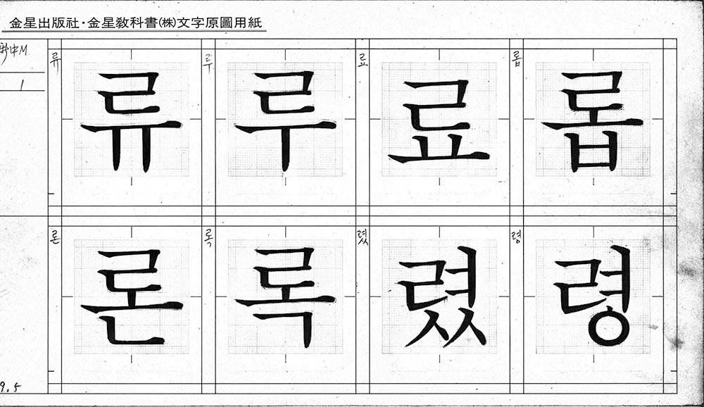
Choi Jeong-ho Myeongjo (Image source: Hangul Designer Choi Jeong-ho Exhibition Facebook)
As the era was changing rapidly and global design trends and social environments were racing toward the cutting edge, the field of font design remained intoxicated by an illusion of the past, driven by this peculiar reverence for Myeongjo. As we know, Myeongjo was drawn with a brush. A brush is not a writing instrument used in our time. No matter how beautiful it may be in itself, it is clearly not a form that reflects the present era. Witnessing this, I began to question why we could not move even a single step beyond existing Myeongjo fonts that still carried the feel of the brush. I concluded that while the structure and framework of Myeongjo should be respected, the emergence of a modern Myeongjo font aligned with the flow of the times was absolutely necessary.
One day, while spending time with these thoughts, I lightly sketched on a sketchbook a Myeongjo font for a new era—something I had been contemplating for some time. I had several design principles in mind for a modern Myeongjo font.
First, its form and structure would be based on the existing Choi Jeong-ho Myeongjo. The underlying framework of traditional Myeongjo is undeniably a masterpiece, rich with the charm and elegance of Hangul.
Second, it would be expressed through modern straight lines and curves, completely breaking away from the brush-like writing feel inherited from the Joseon Dynasty.
Third, curves in characters such as ‘ㄱ, ㅅ, ㅈ’ would be re-created as uniquely Korean curves—fluid yet spirited, and refined. The intention was to clearly express the aesthetic identity of our culture. As the sketches show, even I was surprised at how clearly these conditions were articulated in the initial drawings, which left me feeling satisfied.
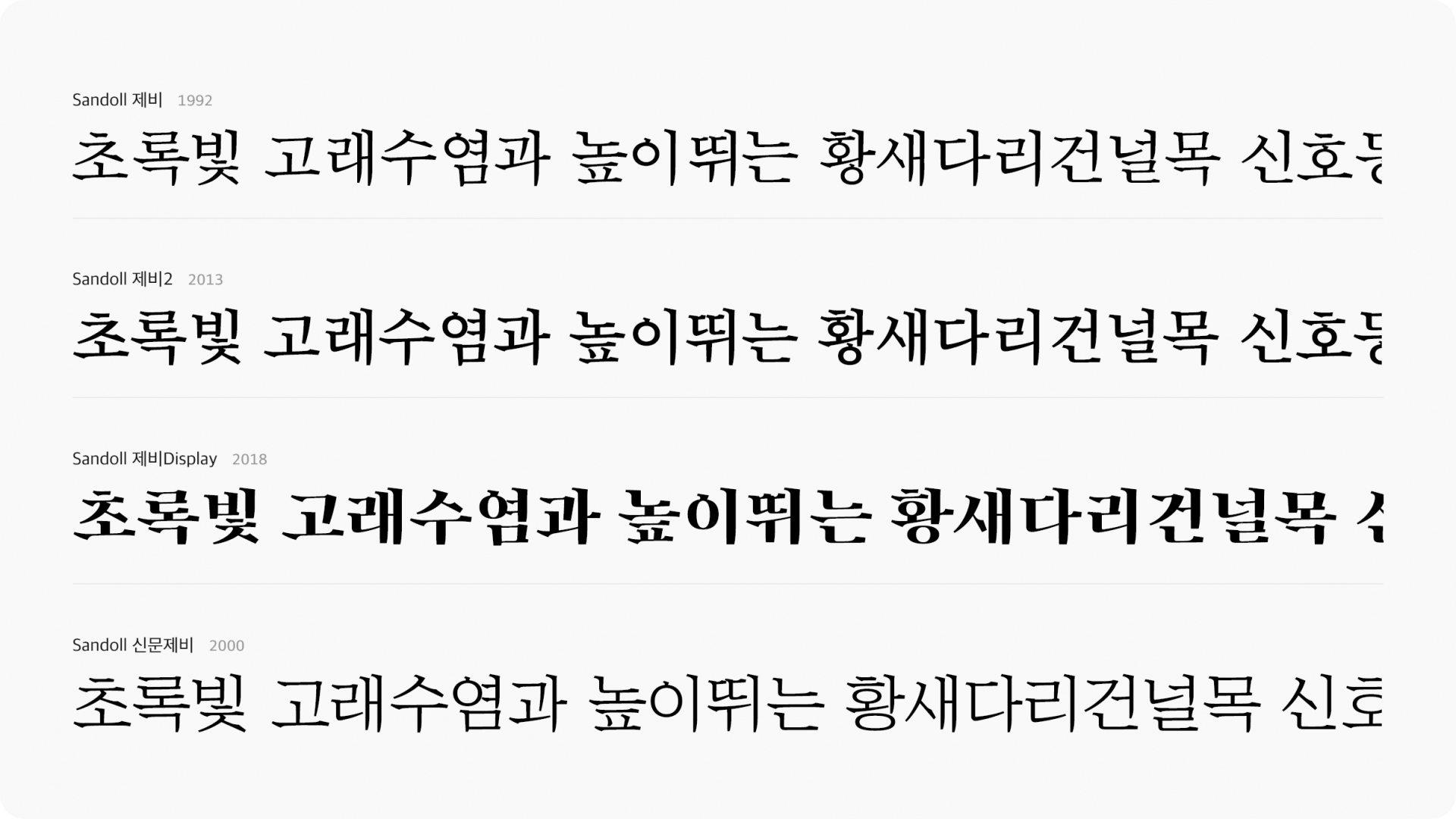
In this way, a modern Myeongjo font named 「Jebi」(제비, Jebi) came to be announced—the first of its kind in Korea. Amid the changes of the times, Jebi delighted designers who longed for new design expressions. It went on to be applied across countless media and enjoyed the good fortune of becoming a steady seller.
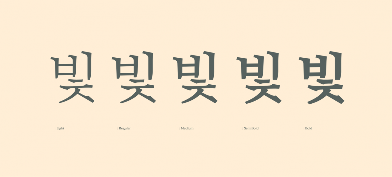
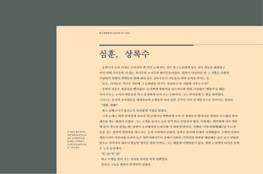
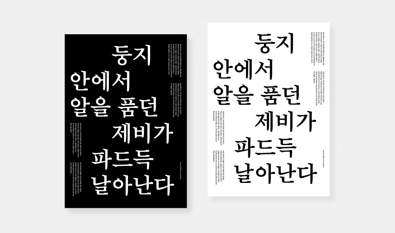
I have given some thought to why 「Jebi」 continues to be loved by designers over such a long period of time.
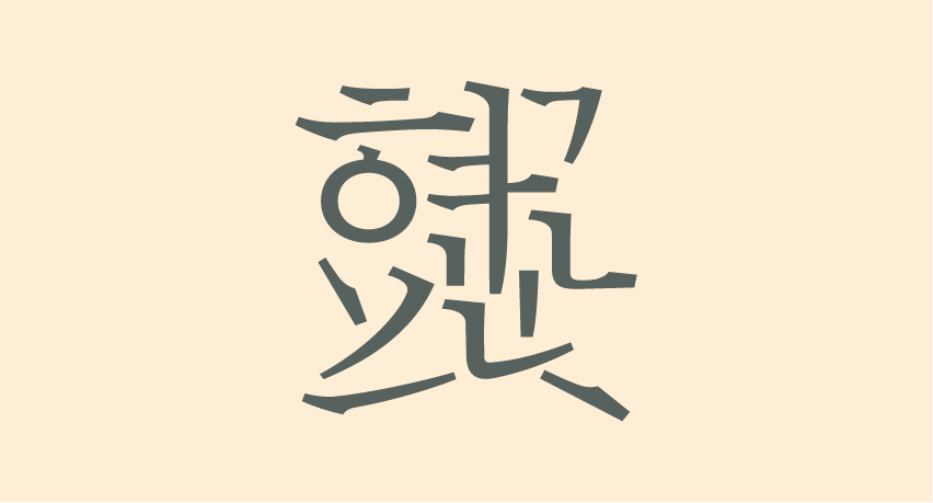
One reason, I believe, lies in the beauty of Korean curves and the elegance of Hangul expressed through the harmony of curves and straight lines. The left-flowing curved bit-chim in the ‘ㄱ’ of ‘가’ may go unnoticed by most, but it clearly distinguishes itself from the curves found in Japanese and Chinese fonts. As mentioned earlier, unlike the “pretty” curves pursued in Japan, our native curves must possess vigor. They should extend diagonally with a sense of force and speed. When examined closely, the stroke maintains an almost straight, fast-paced flow from its starting point to about two-thirds of its length, then suddenly slows down and ends softly in a gentle curve. These distinctly Korean curves come across as an “elegant beauty,” and that beauty leads the human heart toward delight.
Another reason is the rhythm and discipline of lines created by the balanced repetition of straight lines and curves, which exudes a thoroughly modern sense of beauty. This modern beauty—something that cannot be felt in the traditional brush-based stroke—gives designers the confidence to express “our era, as we live it today.”
The reason it was named 「Jebi」 is simple. When I was young, swallows built their nests under the eaves of our house and spent the summer there. They are birds of good fortune that live in close proximity to people, and the clarity created by their stark black-and-white contrast, along with the elegant curves revealed in their bodies, naturally brought to mind this new Myeongjo font—as if those qualities were directly reflected within it.



Insights
A Myeongjo font for a new era, 「Sandoll Jebi」
Until the early 1990s, the world was utterly captivated by the allure of computers. They were seen as all-purpose tools capable of doing anything. People were fascinated by the remarkable performance of the hardware and the efficiency of software such as word-processing programs. Even the mere existence of operating systems like Microsoft Windows felt exhilarating.
At the time, no one complained that the default Windows font was Gulim. And what about traditional Myeongjo and Gothic styles? Even designers looked at Gothic fonts—and especially Myeongjo fonts—with admiration for their excellence, their forms, and the elegance of their details, elevating them almost to objects of “reverence.” In this historical context, Myeongjo fonts—particularly those verified through the original drawings of Choi Jeong-ho—became so sanctified that no one dared to point out problems or even suggest revisions.
Choi Jeong-ho Myeongjo (Image source: Hangul Designer Choi Jeong-ho Exhibition Facebook)
As the era was changing rapidly and global design trends and social environments were racing toward the cutting edge, the field of font design remained intoxicated by an illusion of the past, driven by this peculiar reverence for Myeongjo. As we know, Myeongjo was drawn with a brush. A brush is not a writing instrument used in our time. No matter how beautiful it may be in itself, it is clearly not a form that reflects the present era. Witnessing this, I began to question why we could not move even a single step beyond existing Myeongjo fonts that still carried the feel of the brush. I concluded that while the structure and framework of Myeongjo should be respected, the emergence of a modern Myeongjo font aligned with the flow of the times was absolutely necessary.
One day, while spending time with these thoughts, I lightly sketched on a sketchbook a Myeongjo font for a new era—something I had been contemplating for some time. I had several design principles in mind for a modern Myeongjo font.
First, its form and structure would be based on the existing Choi Jeong-ho Myeongjo. The underlying framework of traditional Myeongjo is undeniably a masterpiece, rich with the charm and elegance of Hangul.
Second, it would be expressed through modern straight lines and curves, completely breaking away from the brush-like writing feel inherited from the Joseon Dynasty.
Third, curves in characters such as ‘ㄱ, ㅅ, ㅈ’ would be re-created as uniquely Korean curves—fluid yet spirited, and refined. The intention was to clearly express the aesthetic identity of our culture. As the sketches show, even I was surprised at how clearly these conditions were articulated in the initial drawings, which left me feeling satisfied.
In this way, a modern Myeongjo font named 「Jebi」(제비, Jebi) came to be announced—the first of its kind in Korea. Amid the changes of the times, Jebi delighted designers who longed for new design expressions. It went on to be applied across countless media and enjoyed the good fortune of becoming a steady seller.
I have given some thought to why 「Jebi」 continues to be loved by designers over such a long period of time.
One reason, I believe, lies in the beauty of Korean curves and the elegance of Hangul expressed through the harmony of curves and straight lines. The left-flowing curved bit-chim in the ‘ㄱ’ of ‘가’ may go unnoticed by most, but it clearly distinguishes itself from the curves found in Japanese and Chinese fonts. As mentioned earlier, unlike the “pretty” curves pursued in Japan, our native curves must possess vigor. They should extend diagonally with a sense of force and speed. When examined closely, the stroke maintains an almost straight, fast-paced flow from its starting point to about two-thirds of its length, then suddenly slows down and ends softly in a gentle curve. These distinctly Korean curves come across as an “elegant beauty,” and that beauty leads the human heart toward delight.
Another reason is the rhythm and discipline of lines created by the balanced repetition of straight lines and curves, which exudes a thoroughly modern sense of beauty. This modern beauty—something that cannot be felt in the traditional brush-based stroke—gives designers the confidence to express “our era, as we live it today.”
The reason it was named 「Jebi」 is simple. When I was young, swallows built their nests under the eaves of our house and spent the summer there. They are birds of good fortune that live in close proximity to people, and the clarity created by their stark black-and-white contrast, along with the elegant curves revealed in their bodies, naturally brought to mind this new Myeongjo font—as if those qualities were directly reflected within it.