
SKT Sans

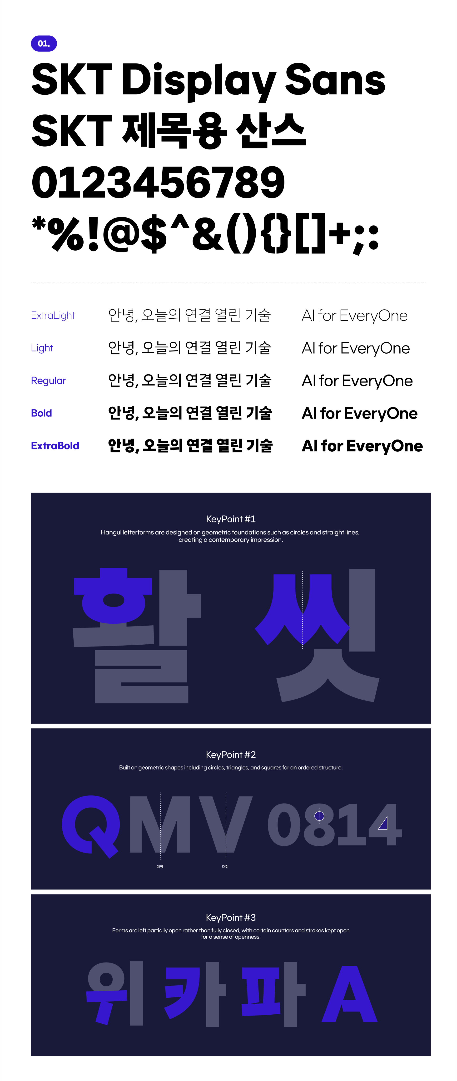
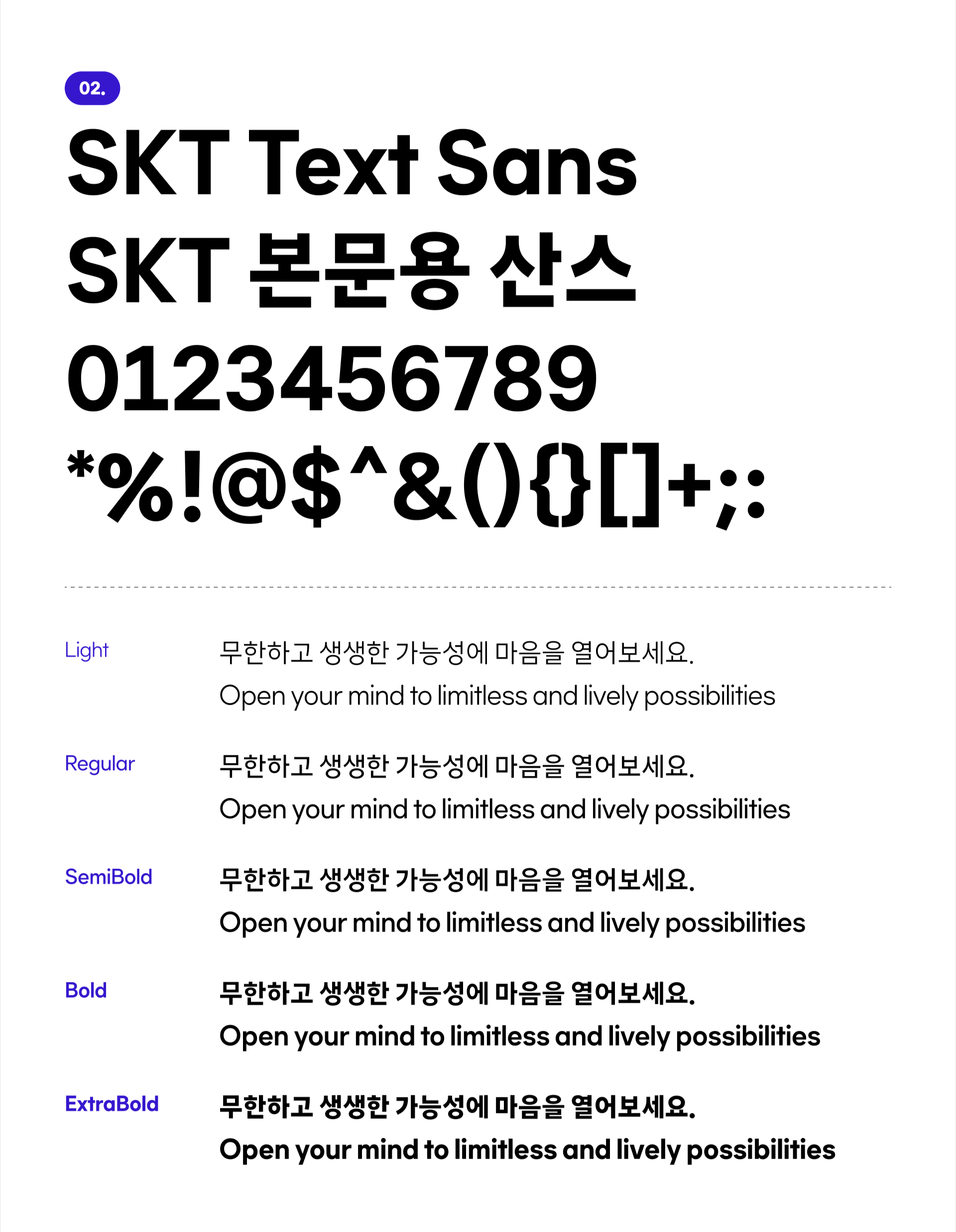
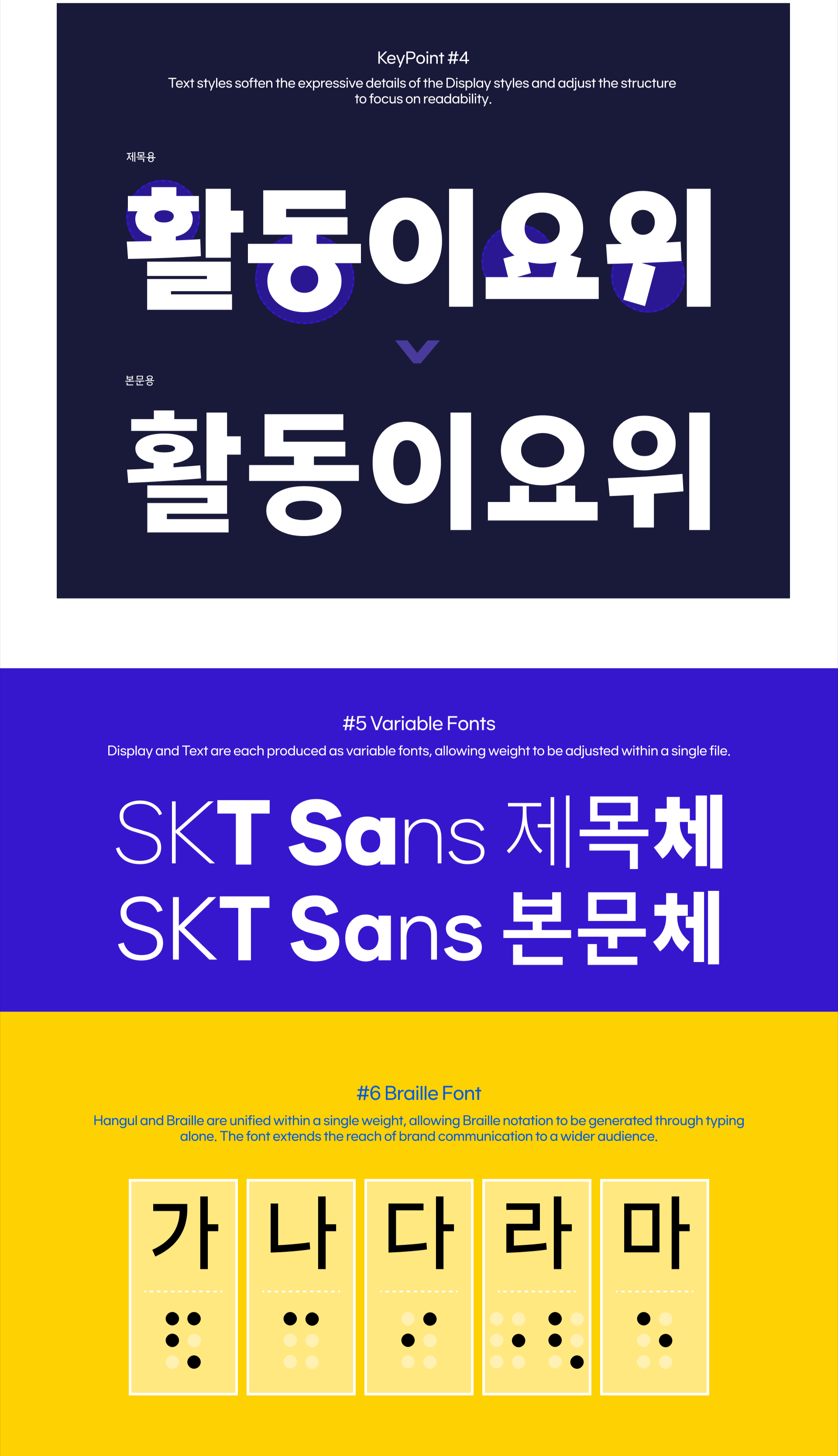
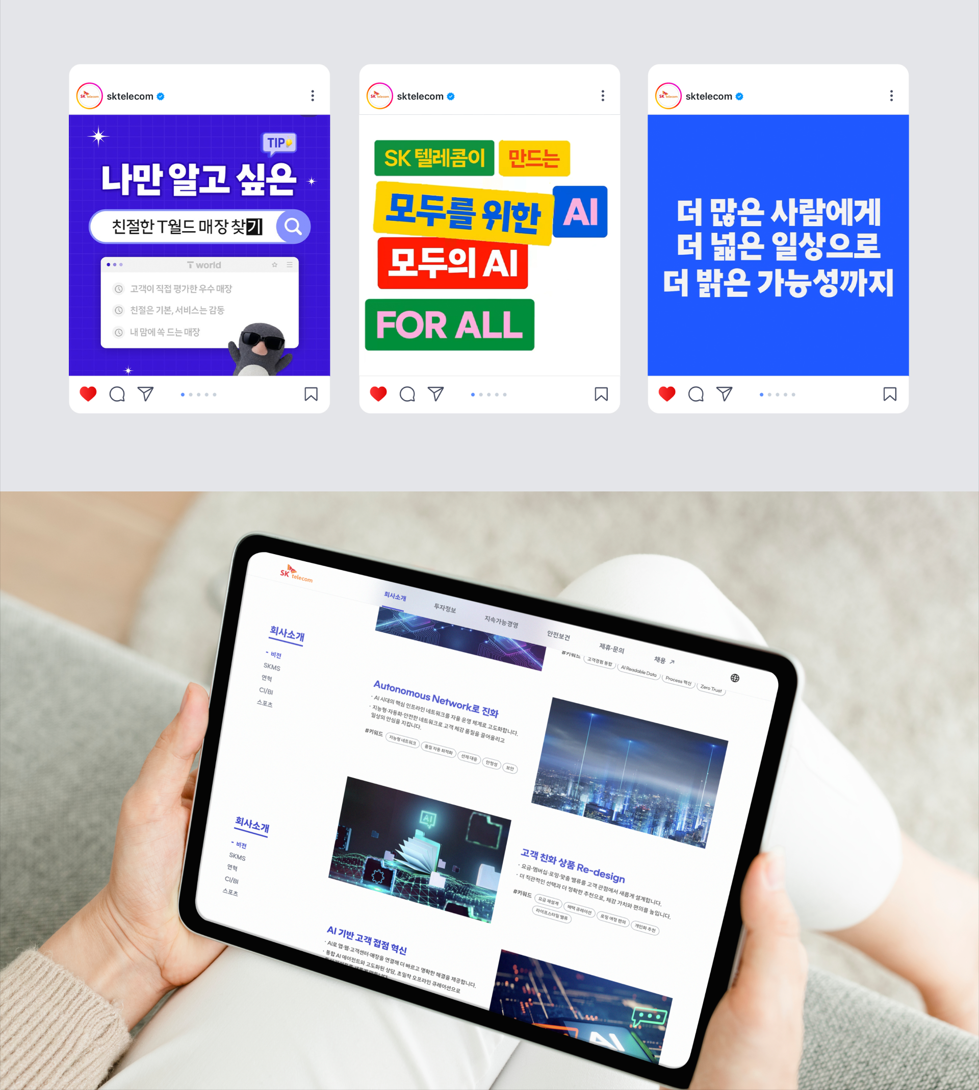
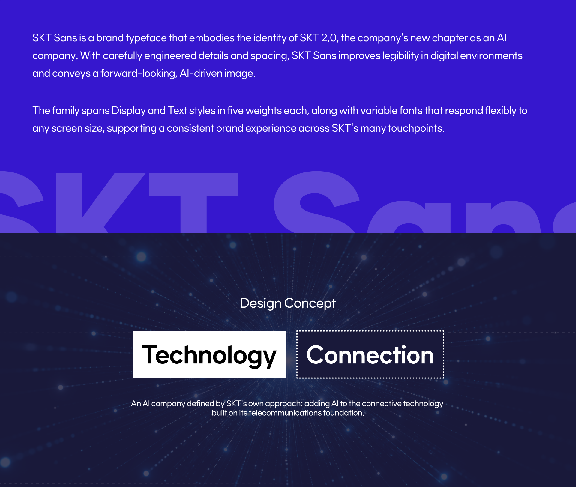
「SKT Sans」 is a custom typeface that reflects SK Telecom’s evolution into an AI company. Designed for clear legibility and a forward-looking identity, it includes five weights each for Display and Text, along with Braille and Variable Font versions. The family ensures a consistent brand experience across SKT’s diverse touchpoints.
ClientSK Telecom
Released2024
Classification
IT
Weight

Display: ExtraLight, Light, Regular, Bold, ExtraBold + VF + Braille

Text: Light, Regular, SemiBold, Bold, ExtraBold + VF + Braille

TeamsSuhyun Lee, Sungwoo Bae, Hyunah Jeong,  Eunyou Noh
Specifications

Hangul 11,172 / Latin 96 / Symbols 976 / Braille Included

Captures the unique culture of a brand and embodies it through typography.

Other projects